2026 Bold Home Decor Color Trends You Don’t Want to Miss
I used to live in a world of beige—walls that whispered, couches that never spoke up. Everything matched, but nothing made my heart skip.
Then one afternoon, sunlight hit a paint sample I’d left on the counter, and the whole room seemed to hum.
That’s when I realized 2026 feels different. Designers everywhere are leaving behind pale tones for deep, soulful color that wakes a space up.
This year’s bold hues aren’t about being loud—they’re about emotion, warmth, and the kind of home that feels alive again.
If you’ve been craving color that lifts your mood every time you walk in, you’ll want to see what’s coming.
These are the shades and ideas that are reshaping homes—and maybe yours next.
Nature-Rooted Hues Are Taking Over
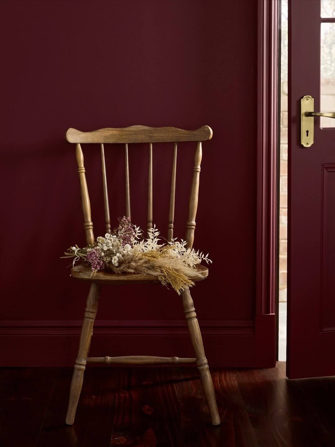
Greens have always whispered calm, but in 2026 they’re speaking up. House Beautiful reports that “a deep burgundy Divine Damson reigns as Graham & Brown’s 2026 Color of the Year.”
That rich plum now joins forest and olive tones popping up on cabinets, drapes, and even doors.
Here is why it works: Earthy color connects the indoors with nature and gives modern rooms warmth. If painting feels like too much commitment, start with small swaps—green pillows, clay vases, or an art print with foliage tones.
When I traded my gray cushions for moss-green ones and added a plum throw, the space finally felt grounded instead of cold.
Once you start seeing how these natural shades calm the eye, it’s easy to reach for deeper color next.
Also read:
Jewel Tones Meet New Neutrals

Deep color is no longer reserved for accent walls. Designers are blending jewel hues with warm wood and brass to create relaxed luxury.
Try introducing one statement piece—a sapphire rug, emerald curtain, or plum chair—and keep the rest soft. These tones behave like neutrals but add far more depth.
When I paired a walnut side table with a sapphire armchair, the mix looked layered but calm, like it belonged together.
Once you’re comfortable with color, warm neutrals help tie everything together.
Warm Neutrals Reimagined
If bold color still feels risky, start with the new neutrals. House Beautiful shares that “Sherwin-Williams and HGTV Home … have united to name a single shade: Universal Khaki, an earthy, mid-tone tan.” This shade replaces stark white with warmth and structure.
Try repainting trim in khaki or swapping a white lamp for one in camel. The subtle color softens light and makes metal accents glow.
I once painted my hallway ceiling in soft tan—it instantly looked taller and more polished.
Once neutrals feel natural, you’re ready for color with real presence—smoky greens and moody jades.
Smoky Jade and Grounded Greens Steal the Show
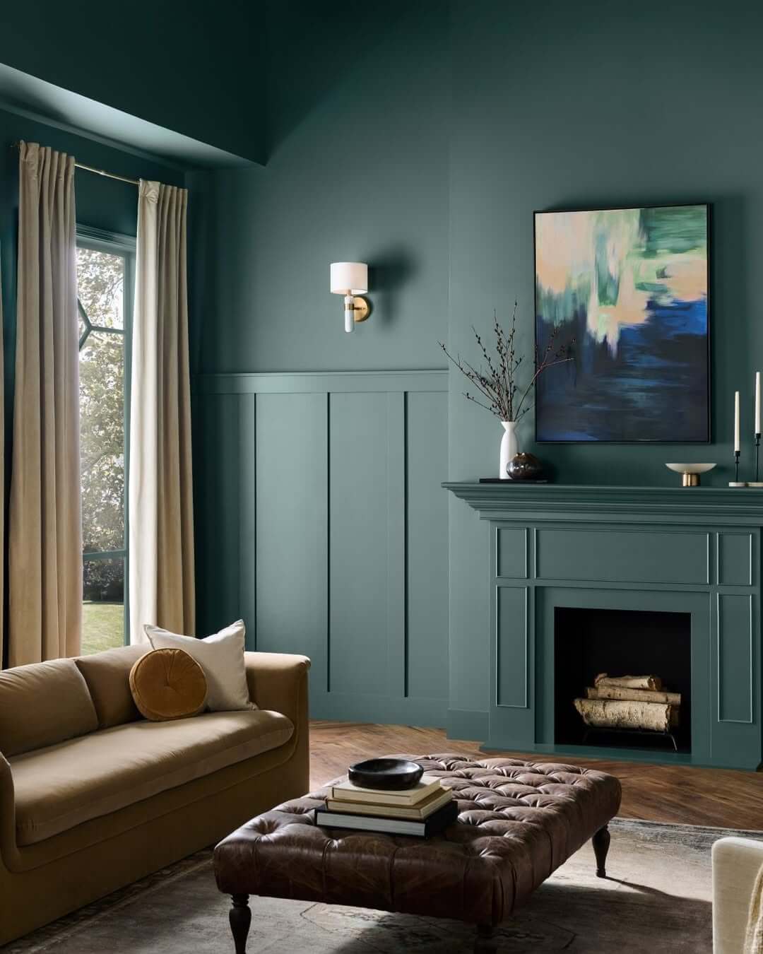
For anyone ready to embrace deeper hues, Architectural Digest reveals that “the 2026 Behr Color of the Year is Hidden Gem, a calming blue-green built off a grounding gray undertone.”
They add that its “smoky jade tone is an ideal companion for both warm and cool tones.”
This green feels serene yet strong—perfect for a kitchen island or bedroom wall. Pair it with warm brass or natural wood for balance.
I painted my front door in Hidden Gem, and even the mail carrier noticed—it gives a peaceful welcome every single day.
And for those ready to go all in, the newest color trend makes the walls themselves the statement.
Color Drenching Becomes Mainstream

Painting every surface in one shade once felt wild—now it’s trending fast. Zillow reports that mentions of “color drenching” in listings are “up 149% year over year.”
This approach wraps a room in a single hue, making it look taller and more cohesive.
Try it in a small hallway or reading nook. Paint the walls, trim, and even ceiling in one shade, then add woven baskets or wood shelves to break it up.
When I drenched my office in muted plum, it turned from plain to personal—a space that feels like it’s holding me, not just housing me.
Once color surrounds you, the only thing left is knowing how to make it last in your daily life.
How to Bring Bold Color Home
- Start small. Swap throw pillows or a lampshade before grabbing a roller.
- Watch the light. Bold tones glow in sunlight but deepen in shadow—test a patch first.
- Layer texture. Mix velvet, rattan, and linen so rich color never feels heavy.
- Repeat once. Use each hue in two spots so the eye connects the story.
Once you feel that shift—a little warmth, a little joy—it’s hard to go back to all-white walls.
You’ve got the color ideas, the palettes, and the confidence to try something new.
Still, it’s normal to pause before picking up the paintbrush. Let’s clear up a few questions that usually come up when people start adding bold color at home.
FAQs About Bold Home Decor Color Trends 2026
How do I know which bold color fits my home?
Start with what already exists—your flooring, light, and furniture tones. Warm wood pairs well with khaki and plum, while cooler marble or gray surfaces love smoky jade or navy. Hold a sample against these materials and watch how it changes through the day.
What if I rent and can’t paint?
Bring color in through furniture and décor. A jewel-toned rug, patterned curtains, or a single painted piece—like a nightstand—makes just as strong an impact without changing walls.
Will bold colors make my space look smaller?
Not if you balance them with texture and light. Matte finishes absorb glare, while mirrors or metallic accents keep the room open. Even one bright lamp can soften strong shades.
How can I test a color before committing?
Paint a large piece of poster board and tape it to your wall. Live with it for a few days—morning, afternoon, and evening. Color shifts with light, so testing saves regret later.
How do I keep the look timeless?
Use bold tones in ways that can change easily—pillows, art, or accent chairs. When trends move on, you can refresh the base without redoing everything.
Final Thoughts
Color isn’t just decoration—it shapes how home feels.
The right shade can calm a busy day, lift a dull corner, or make every return home feel like a small reset.
Start small if you need to. Swap a cushion, paint one door, or try a warm neutral instead of white. You’ll feel the difference faster than you think.
If this post helped you picture a braver home, tell me in the comments—what bold shade are you planning to try first?
I’d love to hear your ideas and see what color story you’ll bring to life next.
RELATED: