Color Palettes That Bring Modern Living Room Aesthetics to Life
Once I began work with the living room colors, I believed that by simply painting the walls with white paint, the room would be considered modern instantly.
Instead, it felt flat and unfinished, like something was missing.
It was at that point that I realized the secret to it all: it isn’t simply selecting one color, but rather coming up with a palette that gives that room a unified appearance.
The right palette not only decorates your walls but it defines the tone of the whole space. Tonal neutrals are quietly minimal, high-contrast colors are bold and energetic, earthy colors can be warm and layered a modern living room can feel calm, bold and energetic, or a bit of both.
The combinations you choose are what make a room feel cohesive, stylish, and alive.
This article will show you how to use color palette effectively in your living room.
From mastering neutral undertones to layering trendy textures, you’ll see how to style palettes that feel intentional, modern, and perfectly suited to your space.
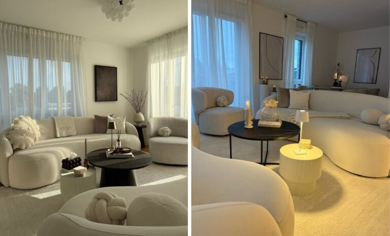
Start With Neutral Undertones
Modern design often begins with a neutral base, but not all neutrals play well together.
Grays, whites, and beiges each have hidden undertones—warm, cool, or earthy—that can make or break cohesion.
Livingetc calls this the “Hidden Hue Rule,” where aligning undertones creates harmony, while mixing clashing ones leaves a room feeling disjointed.
Picture this: you’ve painted your walls a cool dove gray, but your sofa leans warm beige. The result feels slightly “off,” even if you can’t explain why. Now imagine pairing that same gray with a charcoal rug and crisp white trim—the room suddenly feels intentional, layered, and modern.
Design tip: If your sofa is a cool gray, pair it with other cool-toned neutrals like crisp white walls and charcoal rugs. For a warmer vibe, mix sandy beige upholstery with creamy whites and soft taupe accents.
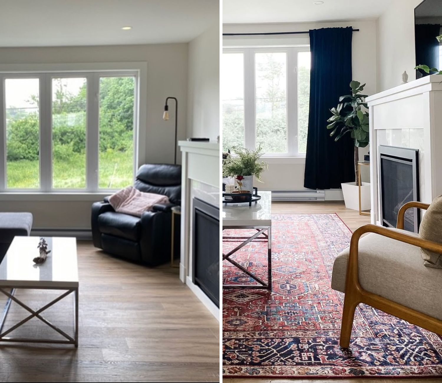
Energize With Bold Contrast
One of the easiest ways to stop a modern living room from feeling bland is to bring in bold contrast. Contrast doesn’t just look good in photos—it changes how you feel in the space.
A room with sharp pairings feels lively, dynamic, and perfect for entertaining friends or sparking creative energy during the day.
Imagine walking into a sleek white living room where a single navy accent wall immediately grabs your eye. A terracotta armchair warms the space, while a brass lamp adds a gleam that keeps it from looking too serious. The balance of calm and energy is what makes the room unforgettable.
Design tip: Pick one grounding neutral (like crisp white or charcoal), one bold color (navy, emerald, or burgundy), and one warm accent (terracotta, brass, or burnt orange). Limit yourself to three or four shades so the palette feels polished instead of chaotic.
Apply the 60-30-10 Rule
If you’ve ever felt unsure how much of each color to use, the 60-30-10 rule is your design lifesaver.
Real Simple explains it as 60% dominant color (walls or sofa), 30% secondary color (rugs, curtains), and 10% accent (pillows, art, or a single chair).
This balance is what keeps a room from feeling overwhelming or underdone.
For example, imagine soft gray walls and a gray sectional making up the 60%, forest green velvet drapes and a patterned rug as the 30%, and a mustard throw with brass side tables as the 10%. Suddenly, the space feels structured but far from boring.
Design tip: Try a dominant soft gray, secondary forest green in drapes, and an accent of brass or mustard pillows. The ratio keeps everything balanced, no matter what shades you pick.
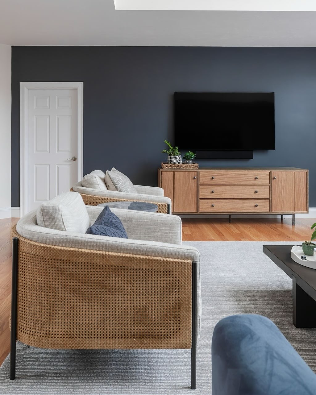
Embrace Mid-Century Modern Vibes
Modern aesthetics often borrow from mid-century palettes, which blend neutrals with pops of color.
BHG suggests mixing warm wood tones and off-whites with jewel-like accents—navy, orange, or sage—for a look that feels timeless yet current.
Picture a walnut media console paired with cream walls and a deep navy accent chair. Add a burnt-orange rug or a green ceramic vase, and suddenly the room nods to mid-century elegance without feeling dated. The beauty is that these palettes play well with both sleek modern furniture and vintage finds.
Design tip: Pair a walnut media console with cream walls, then bring in a single navy chair or a burnt-orange rug. It nods to mid-century style without turning into a retro set piece.
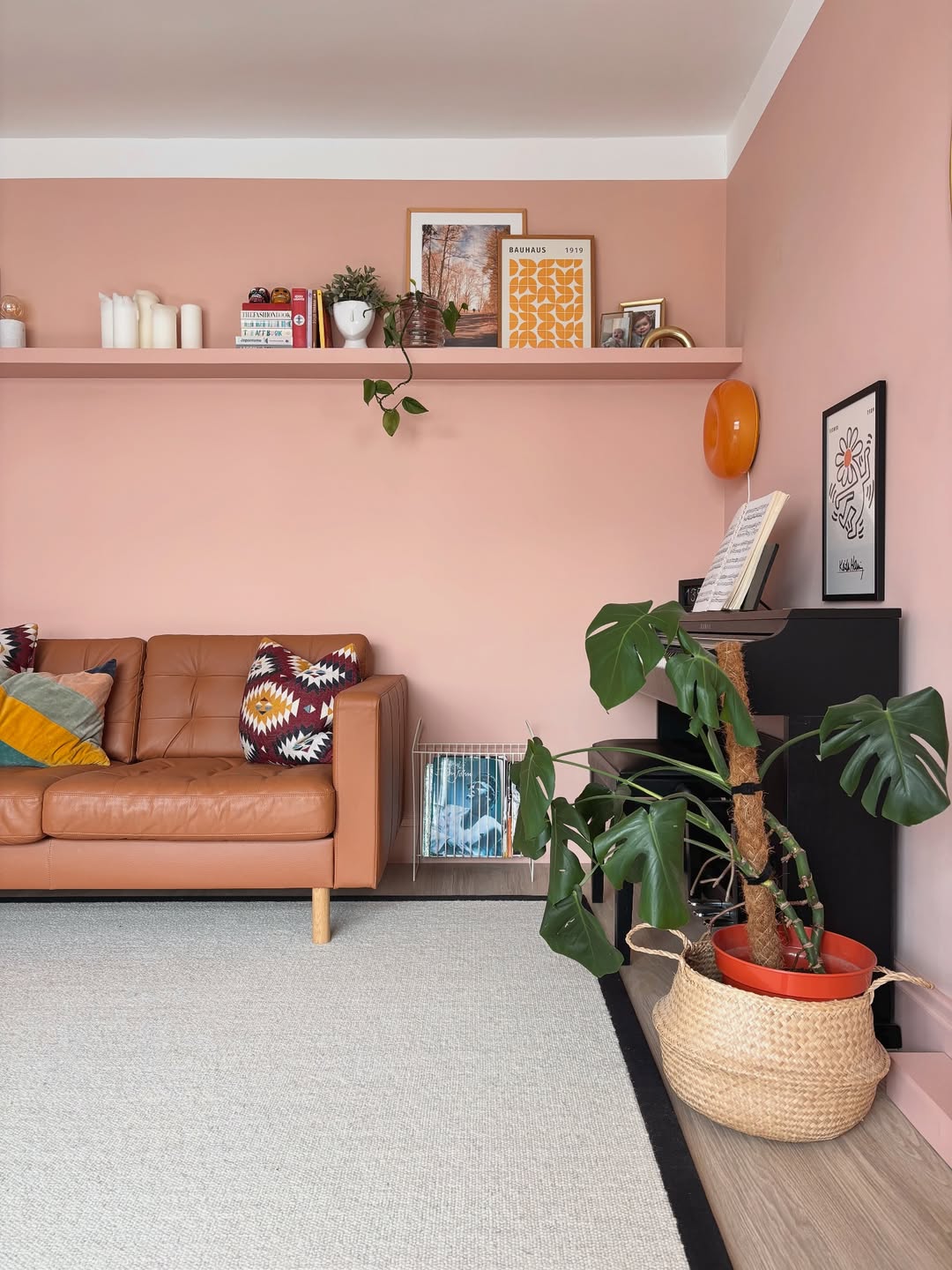
Layer Trendy Neutrals With Texture
Neutral doesn’t have to mean boring.
In 2025, earthy shades like terracotta, chocolate brown, and plaster pink are trending, especially when layered with metallics and textured fabrics.
Homes & Gardens notes that adding depth through texture—bouclé, velvet, or wood—keeps these palettes modern and interesting.
Think of plaster-pink walls paired with a mocha velvet sofa, topped with bronze side tables that catch the light.
Add a boucle throw and a chunky knit pillow, and suddenly the room feels like it belongs in a design magazine. It’s neutral, but layered, warm, and full of character.
Design tip: Use plaster pink walls as your base, layer a mocha velvet sofa, and finish with bronze side tables. The mix of color and texture makes the room feel curated, not flat.
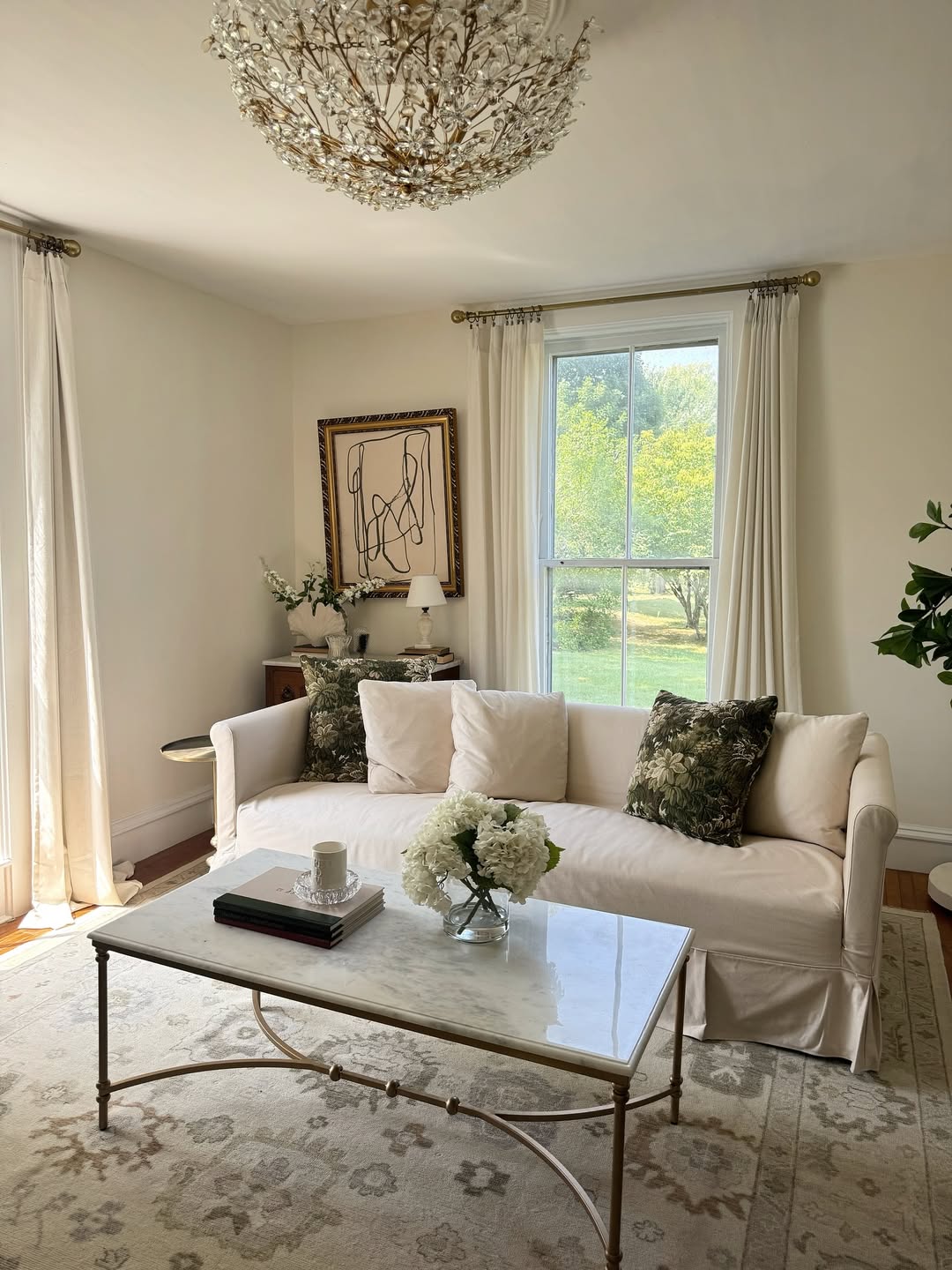
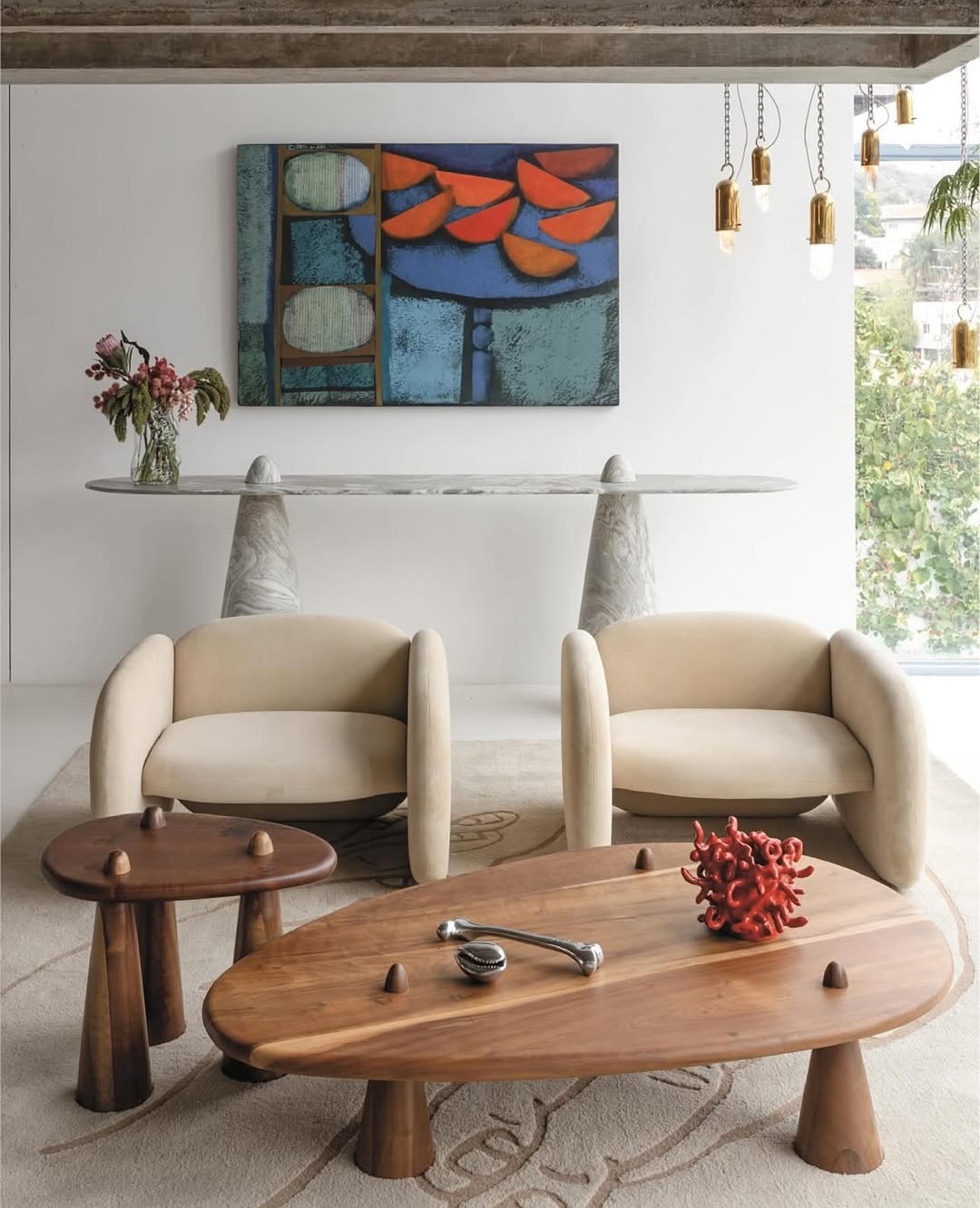
Try Organic, Tonal Palettes
Not all contemporary living rooms have to be highly contrasted – here, the most comforting rooms are constructed on the basis of tonal ranges. These pallets sequentially blend out of each other, and this produces a soft gradient effect that makes a room feel calm, open, and people can live there forever. They can fit into a small apartment or people who just need some relaxed time after a hard day is over.
Imagine a room that is cream on the walls, peach on the sofa, lavender with the throw pillows and muted greens of the plants.
The colours are smooth and help you feel comfortable lingering. Tonal palettes are beautiful in natural light, too, allowing the colors to change beautifully through the day.
Design tip: Pick three or four colors from the same tonal family, like blues (sky, navy, steel) or greens (sage, olive, emerald). Layer them across walls, upholstery, and accessories so the eye glides smoothly around the room.
Mix High-End With Everyday
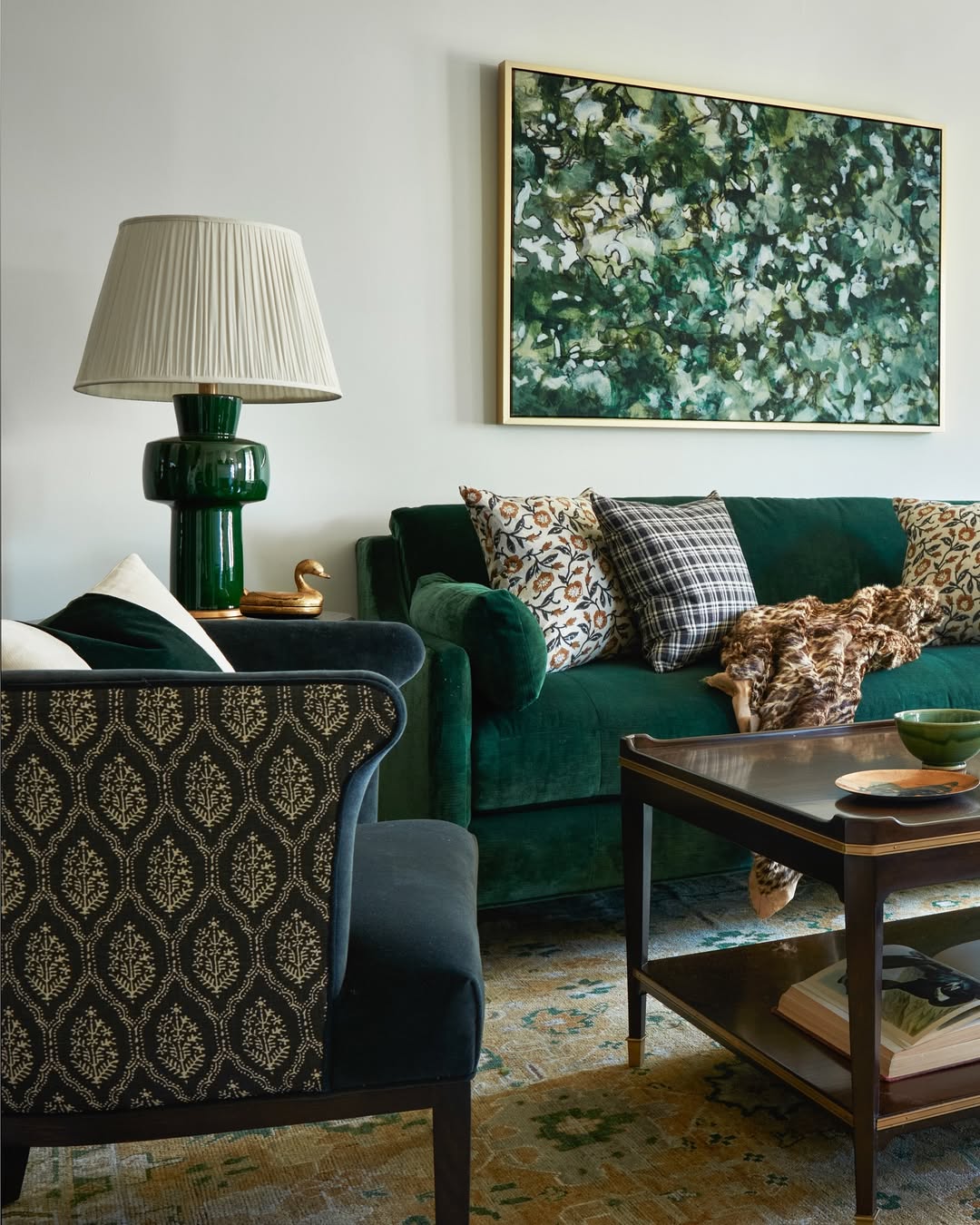
Color palettes are not self-sufficient – they come alive when combined with the right finishes.
Imagine an emerald velvet couch, perched on a jute woven rug, all dressed in a bouclé throw, and a brass-finished lamp. The combination of jewel tone and organic texture suggests design as well as costly materials-even though each piece is affordable individually.
Design tip: Combine a jewel-toned emerald green sofa with a jute balance and velvet throw. The textural interplay of rich masses and otherwise natural looks animates the palette.
Why It Matters
The right living room color palette is not just a matter of trend following – it’s about defining how you experience your space every single day.
From brightening up the morning, to calming the evening, to enjoying family time; an optimized palette creates a more cheerful day and a more harmonious night.
So, you think about the colours around you, because they influence how you’re going to relax after work, how you’re going to entertain guests, and of course, how much you probably enjoy going home on a rainy Sunday evening.
When your palette feels intentional, your living room ceases to be “just another room” and transforms into the heartbeat of your sanctuary.
FAQ About Modern Living Room Palettes
What colors make a living room look modern?
In recent months, living rooms dominated by neutral palettes-shades of white, gray, and beige combined with high-contrast accents (navy, emerald, terracotta)-have been celebrated in magazines and on TV. The combination of clean-cut bases with strategic pops gives the ensemble an updated, fresh sound.
How many colors should I use in one palette?
Limiting the list to three to four dominant shades is all that is needed The 60-30-10 rule is a good rule to go by: 60% dominant color, 30% secondary and 10% accent. This looks cohesive and not haphazard.
Can I mix warm and cool tones in the same space?
Yes-but you need to do it carefully. The tonal combinations (cool gray and crisp white, warm beige and subtle whites) create a harmonious sensation rather than one of clashing tones.
Do small living rooms need lighter palettes?
Small rooms feel larger in lighter colors such as creams, pastels, and soft grays. But other color arrangements where hues flow into one another (called tonal palettes) also do a fantastic job because they don’t introduce visual clutter.
Closing Thoughts
Your living room isn’t just four walls – it’s the heart of your life. The colors you pick affect how you feel, how you relate to others, and how happy you are while you are at home.
A modern, layered, and intentional palette not only looks good – it allows you to live the life you want.
The best part? Renovation is neither necessary nor expensive. Sometimes it’s a new coat of paint, a new rug with an assertive color or design, or a new throw that brings a new texture to the space.
If this gave you inspiration, save the palette idea you like most and try your own in your home. Also, let us know which colour combination you wish to try first.
Also, check out this article on How to choose the right furniture for your living room.