How to Choose the Perfect Color Palette for Any Room
I will never forget the day when I painted my apartment. I thought I’d nailed the perfect chic gray, only to find in the morning sunlight that it has turned to a pale lavender mess.
That is when I learnt the harsh reality about color choices, it’s not just about picking nice shades, it is about how the shades live in your very room, with your light and furnishings, and your unique personality.
The good news is that you do not need to feel overwhelmed picking a beautiful, soul-enhancing palette.
But here’s the good news: selecting a beautiful, soul-soothing palette doesn’t need to feel confusing.
With a little theory, some hands‑on testing, and a clear idea of how you want your space to feel—restful, energizing, focused—you can create a room that looks curated and yes, feels like you.
Ready? Let’s dive in.
Start With the Basics: Understanding Color
The color wheel isn’t just for art class—it’s the secret behind every harmonious palette. Here’s what to know:
– Complementary colors (like blue and orange) pop—they deliver high contrast and energetic flair.
– Analogous palettes (think green, teal, blue) whisper calm—they’re harmonious and soothing.
– Triadic schemes (red, yellow, blue) hit the sweet spot between bold and balanced.
Action step: Pay a visit to your local hardware/paint store. Take a handful of chips–one complimentary pair, one analogous trio, a triadic trio. Stick them to your wall and at various times of the day look at them.
See how the play of light changes their demeanor on your walls–that is where the magic (and the errors) are clearly visible.
One of the most expensive mistakes DIY painters make is to skip this test drive, commonly resulting in redo after redo and wasted paint.
Warm vs. Cool: Match the Mood to the Room
Colors can talk– even when they are quiet. Warm colors (reds, oranges and yellows) are stimulating and encourage interaction whereas cool tones (blues and greens and purples) are calming and easier to relax.
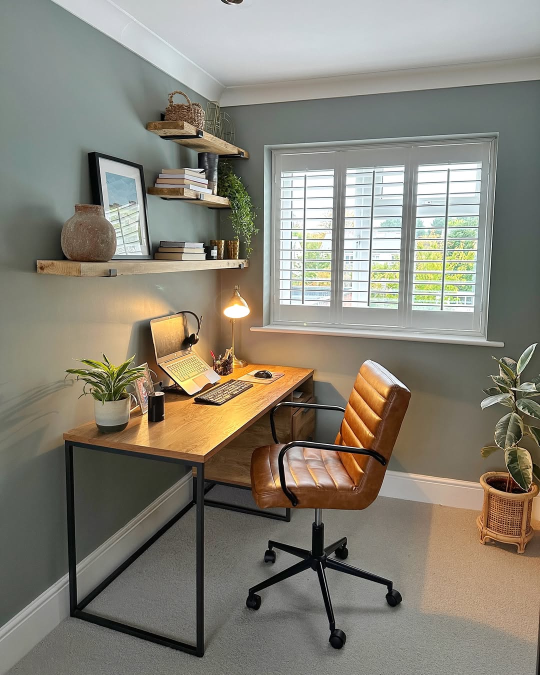
Personally, in my dining room, I chose a dark terracotta to support informal get-togethers. At home office, a peaceful sky-blue surrounds me and makes me concentrated and stable.
Tip for a small space: In cramped areas, lighter hues cooler shades, even pale blush greens or dusty pinks can make walls appear to recede, so the room seems spacious and more open.
Action step: Ask yourself: What is the vibe in this room? Hosting friends? Focused work? Indolent sleep hours? The intent lead the colors. Order some swatch samples and apply a couple to see how it feels within the space itself.
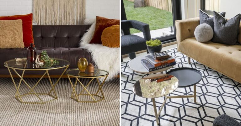
Don’t Forget the Neutrals
Shades of whites, grays, beiges, taupes, etc. are much more than a safe background for your home. They become a grounding backdrop wherein your furnishings and accents of character are able to take center stage without being overwhelming.
A neutral palette, properly done, does not keep the feeling that it is bland, it comes across as a deliberate use.
Designers highlight that neutrals are especially fascinating since they offer a sense of balance in sight and yet they are open to texture, depth and even a hint of contrast.
Why they matter:
– Versatility: A neutral base can shift seasons and styles with ease—just swap pillows or art, and you’ve got a refreshed look.
– Calming effect: In today’s overstimulated world, neutral tones are like a breath of mental space. They promote clarity, restfulness, and understated elegance.
Action step: Consider the mood of your room:
– Cozy beiges or creamy whites are the best options in low-light spaces.
– In sun-drenched rooms, use a cooler or softer white or light gray.
Define the Purpose of the Room
Each room in your home serves a purpose place to relax, socialize, rest and a place to work or create. The color palette must be in aid of the purpose, emotionally and practically as well.
– Bedroom: Blues, delicate shades of green, or subdued grays will be relaxing enough to induce sleep.
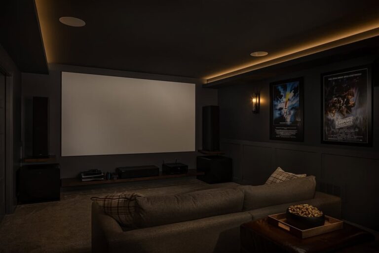
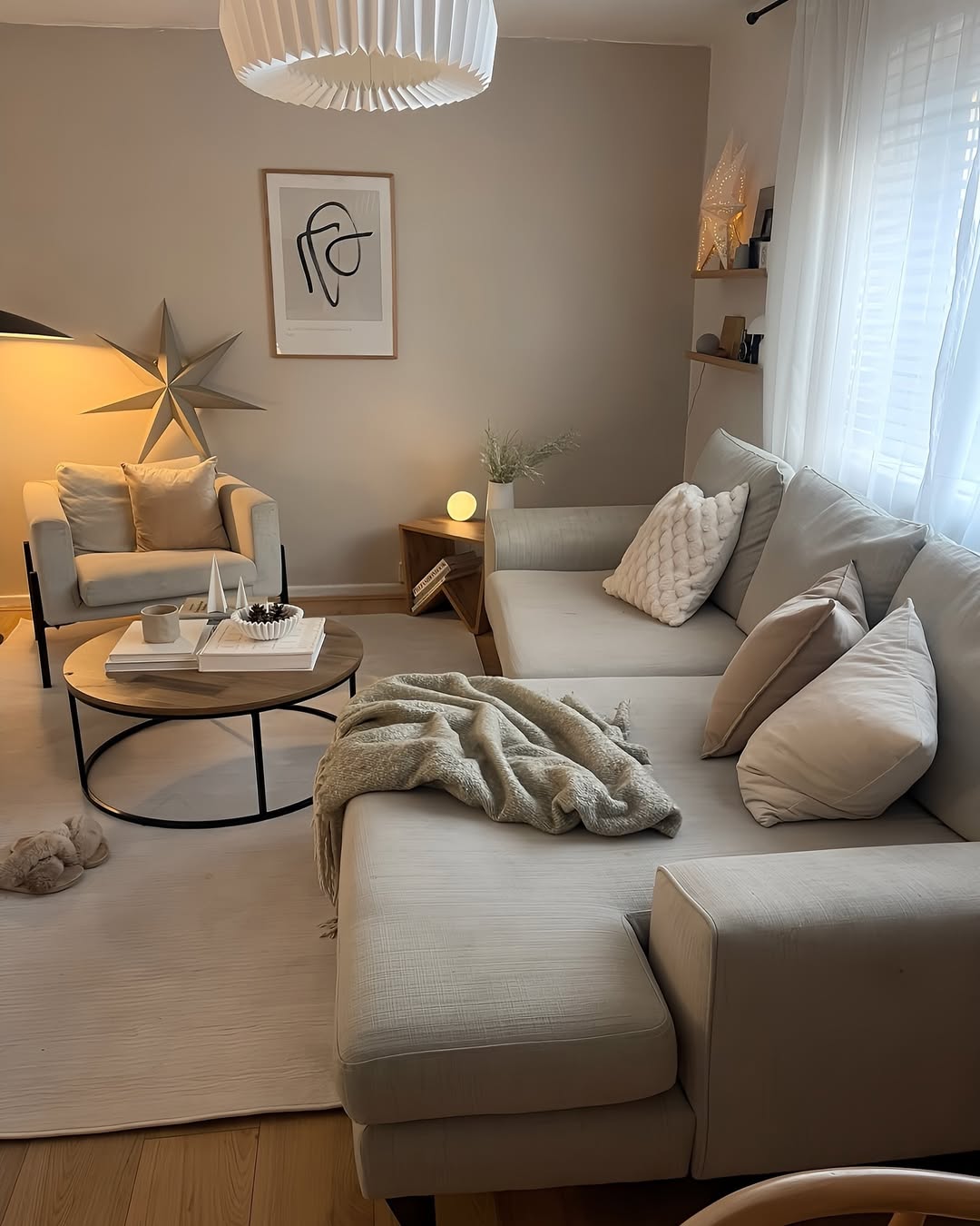
– Living Room: grounded colors or welcoming neutrals will foster warmth and connectedness.
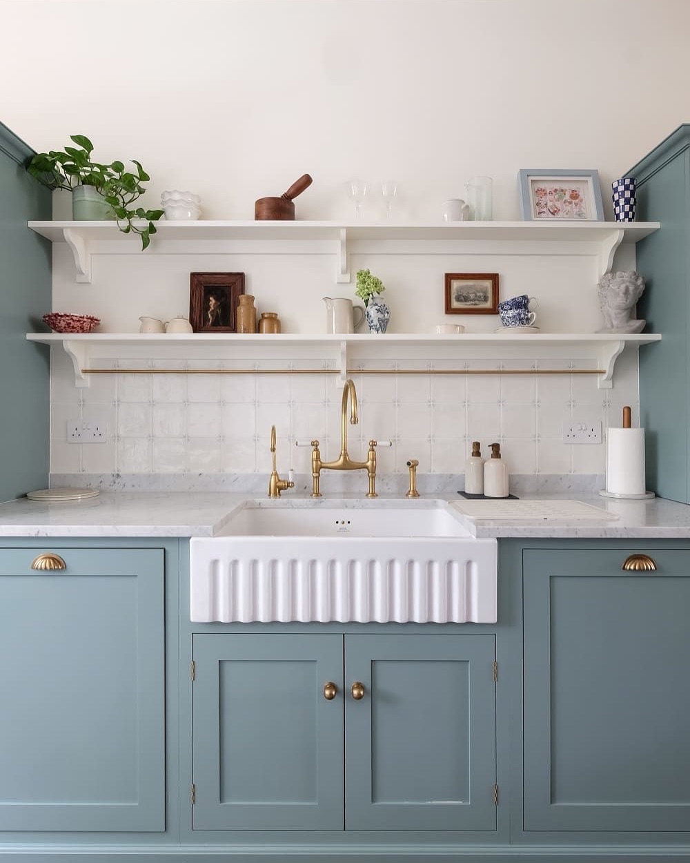
– Kitchen: lighter, sparkling colors should be chosen-lively whitish or cheery yellows-that provide soaring effects.
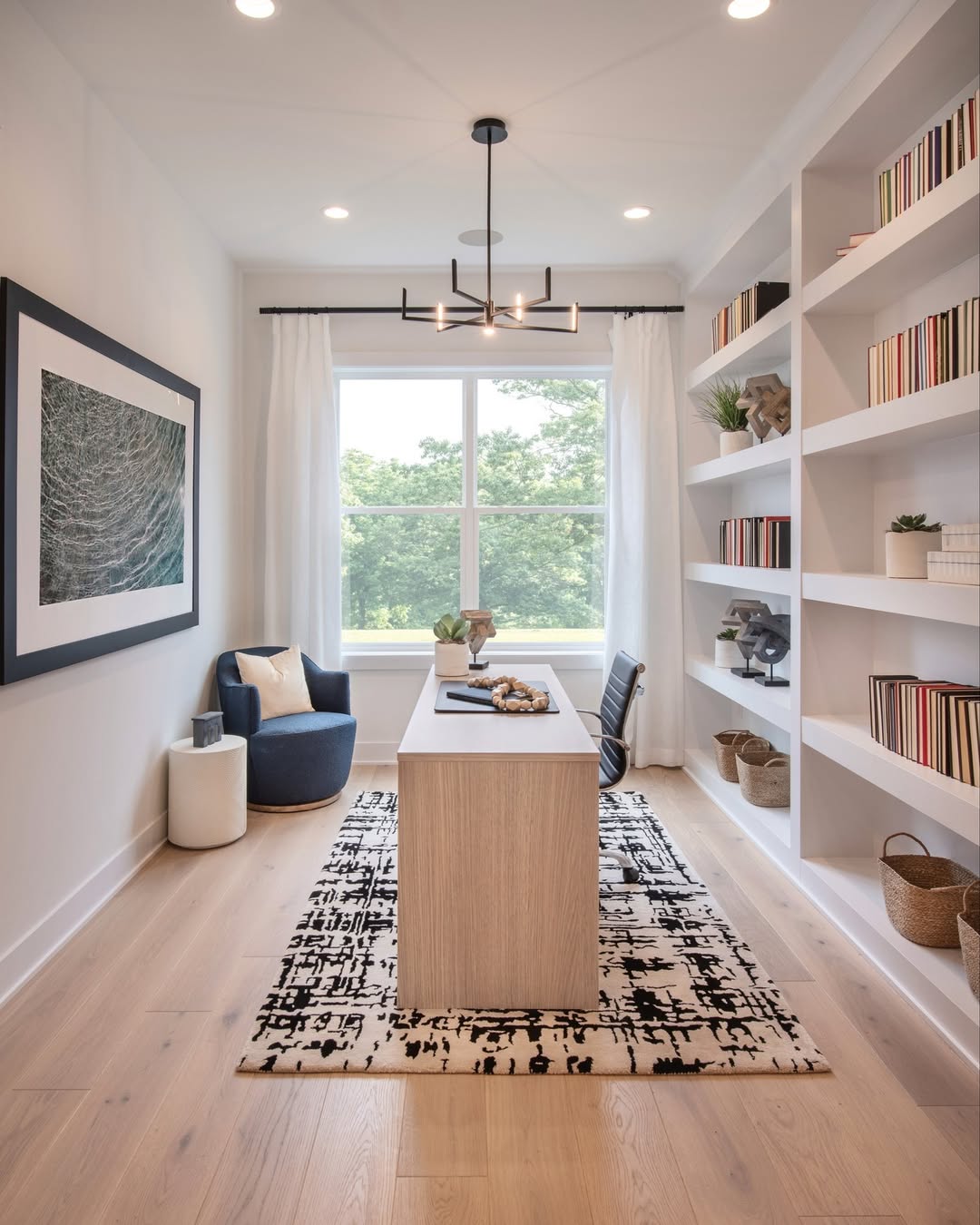
– Home Office: You can stay cool with the around-the-clock shades like soft blue or neutral equilibrium.
Action step: Brainstorm on three adjectives that describe how you want the room to feel, i.e., cozy, bright, and inspiring. Those descriptors must be reflected in any colour you sample. When it does not, then it is not the right fit yet.
Gather Inspiration the Right Way
Reading Pinterest can be a force of creativity–or it can result in paralysis by options. The secret is just to listen to what is catching your eye. The same theme in your bookmarks is the secret to your style.
Personal touch: In my living room, the mood board pictures were all with dusty blues and mustard color. It was my backbone palette–consistent, cohesive and absolutely me.
Tip for small spaces: Nothing can be a better color inspiration than nature. This is where you break out the soft tones of the beach–sand, sky, driftwood–or the rich tones of the forest–moss, bark, leaf green. These palettes are classic but earthly.
Action step: Make a mini mood board (using an app or on paper) of 10-12 images, colors or paint swatches. Put them down and enquire: Do they resemble me? Are they presented in healthy color contrast? If so–you are inclining into your palette.
Test Before You Commit
Paint can be as fickle as mood lighting—what looks flawless at noon may fall flat by dinner. Lighting considerations are of paramount importance to the success of a shade.
A study by NIST demonstrated that LED light quality could be used to shift our perception of color in order to make even premium paints look different under different bulbs.
Why this matters: Your wall is not a fixed surface, its exposed to daylight, lamp light, and so forth. Sampling is the protection you have against the expensive process of making mistakes.
Action step: Whenever possible, test a paint color on your wall. Place pieces of individual squares across in a variety of locations, and sample through the daylight hours of sunshine, the night lamps and the night light. It is surprising how radically they change.
Pro tip: Don’t forget your finish matters just as much as your shade:
- Matte: hides imperfections but isn’t as cleanable
- Satin: strikes a luxurious balance—durable yet soft
- Gloss: adds life and sheen—perfect for trim
For walls, satin often gives the upgrade without showing mistakes.
Add Personality with Accents
Not ready to commit to full-room color? Start small.
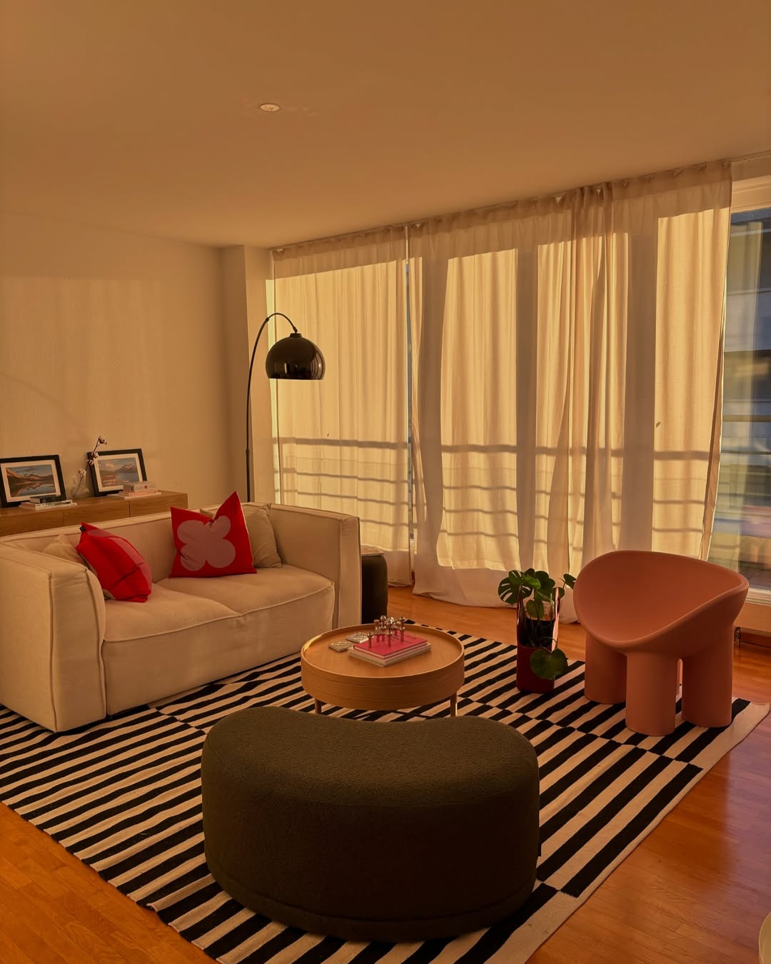
Start with textiles, art, and decor. Or, simply exchanging a statement pillow, bold rug, or art piece can repurpose a room without flaking on a bit of paint.
My personal favorite: Changing of pillows according to seasons: burnt rust and burgundy in the fall, and refreshing blues and soft greens during the spring. It is a sort of mini-refresh which does not involve paint and mess.
Tip for a small space: Paint the walls light and allow accent pieces to provide the presence. This will not make the space feel cramped and allow you to express your personality.
Action step: Pull one accent inspiration element—maybe that throw that makes you smile—and let your color palette grow from there.
Why It All Matters
Selecting a color scheme is not only a design process, but it is a specification of moods.
Research indicates that some color combinations influence emotions, cognitive performance, and the duration of time we spend in a room.
Consider this;
- A tranquil bedroom palette may help you sleep deeper.
- A vibrant kitchen palette can subtly energize your mornings.
- A focused office palette can sharpen your productivity.
Getting your colors right isn’t about perfection—it’s about creating an environment that supports how you want to live.
FAQs: Choosing the perfect color palette
How many colors should I include in a palette?
A balanced palette usually follows the 60-30-10 rule: 60% main color, 30% secondary, and 10% accent. This keeps the room cohesive while giving it depth.
What’s the best neutral for small spaces?
Lighter neutrals—like soft whites or warm beiges—work best in compact rooms because they reflect light and make the space feel larger. Darker neutrals can still work but use them sparingly as accents.
Do colors really influence mood?
Yes. Research in color psychology shows that warm tones (reds, oranges) can energize and stimulate, while cool tones (blues, greens) reduce stress and create calm. Choosing colors based on function (like calm hues for a bedroom or uplifting shades for a kitchen) helps align your environment with how you want to feel.
How do I test colors without painting my walls?
Peel-and-stick paint samples are a renter-friendly option that you can move around your walls throughout the day. You can also tape large paint chips directly to the wall to see how they interact with light and furniture.
What if I change my mind after painting?
That’s normal. Paint is one of the most affordable design mistakes to fix. Many designers recommend starting with smaller walls or accent areas before committing fully, so adjustments are easier.
Closing Thoughts
No rules are set in the choosing of the right color palette, and this is because it is the art to craft your space in the color palette that suits your moods and lifestyles, and above all, your story.
Colors affect our mood each and every day: the tranquility of a muted green bedroom, the excitement of a bright kitchen, and the concentration of a white-colored home office.
By spending a little time sampling the colors, watching them change under different lighting conditions, and rounding out the sensations with subtleties such as accents, you personalize a room rather than relying on how it looks.
When Sunday night comes and you are relaxing in your newly painted house, you will realize it was not about the paint but rather about making it a space that feels like a part of you.
The ideal palette is not one that everyone will drool over when they see it, it is one that makes you sigh when you open the door.
If you liked this article, do check out our article on – The Ultimate Guide to Choosing the Perfect Kitchen Cabinet Color
And on an ending though, we would love to know which one of these colors did you like?
Please comment below and let us know as well.