Kitchen Cabinet Color Ideas That Make Your Kitchen Look Expensive
I’ve seen kitchens with beautiful countertops, expensive appliances, and plenty of space that still somehow feel unfinished.
Then I’ve seen much simpler kitchens where the cabinets make everything around them look better.
That difference is why I wouldn’t choose a kitchen cabinet color by asking what’s popular right now.
Cabinets take up too much visual space for that.
The color sits directly beside your countertop. It meets the backsplash. It changes how the flooring looks. It surrounds the hardware and appliances, and it can look completely different in morning light than it does while you’re making dinner.
So if you want your kitchen to look more expensive, don’t start by searching for the perfect paint color.
Start with the kitchen you already have.
Take a straight-on photo from the doorway before collecting paint samples.
Look at the countertop, backsplash, flooring, appliances, and cabinetry together.
Which one do you want people to notice first?
Keep that answer in mind because the best kitchen cabinet color isn’t necessarily the prettiest color on the paint card.
It’s the one that makes everything around it look as though it belongs.
Start With What You Can’t Easily Change
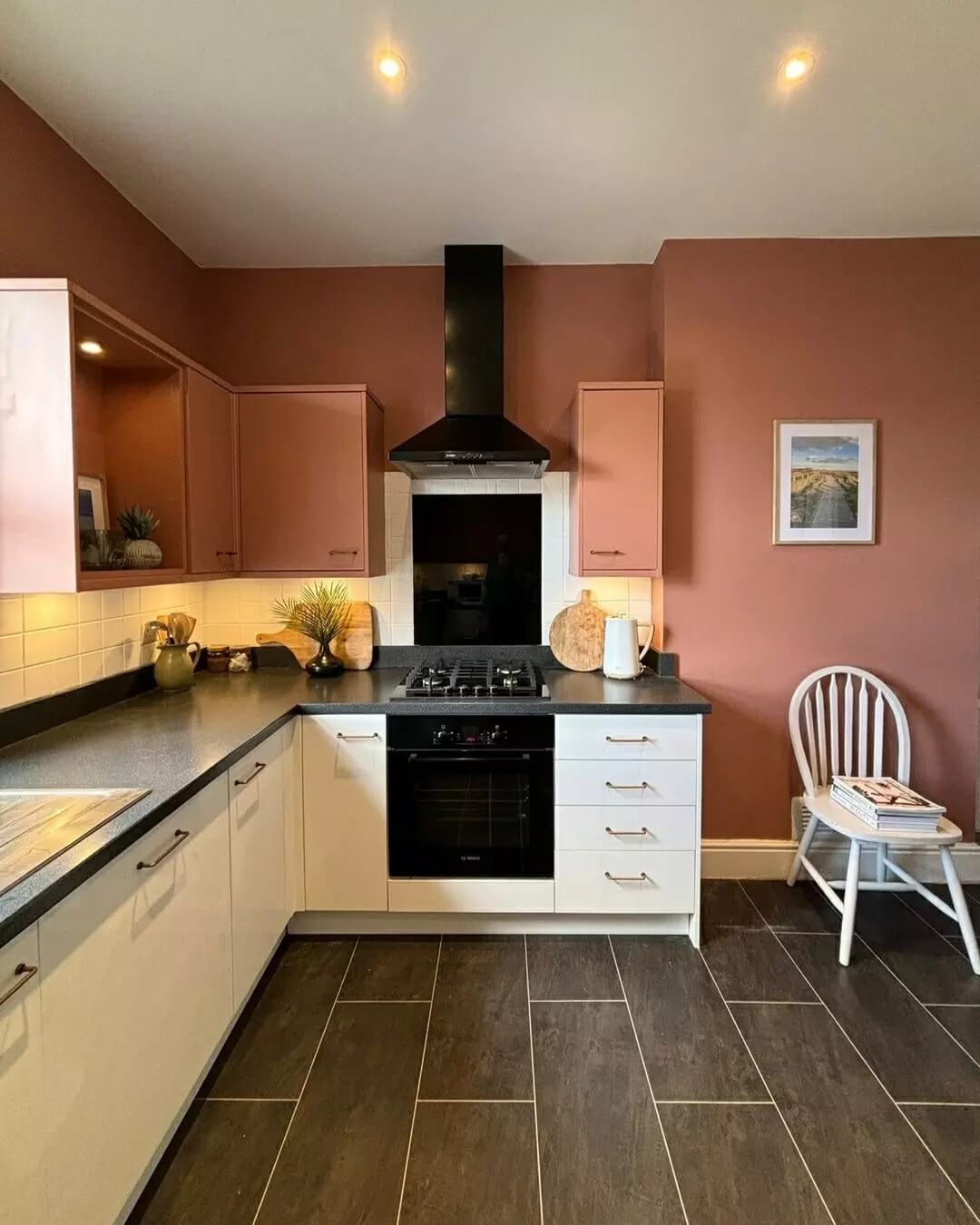
Before thinking about green, cream, mushroom, or navy, look at the things you’re probably keeping.
Start with the countertop.
Then the backsplash.
Then the flooring.
If your appliances are staying, include those too.
Homes & Gardens recommends starting with the kitchen’s fixed finishes before choosing paint, advising readers to “begin with the parts of the kitchen that are already decided or will be most expensive to change.”
I like starting here because it immediately narrows your choices.
Say you have warm stone countertops with creamy movement and honey-toned flooring.
A chilly white that looked beautiful online could suddenly make those surfaces appear more yellow.
A softer cream, mushroom, or warm taupe may sit beside them far more comfortably.
The opposite can happen with cooler stone.
This is why I’d never choose cabinet paint while standing in the paint aisle.
Take photos of the fixed finishes with you, or better yet, bring paint samples into the kitchen.
Your cabinets need to live with these surfaces every day.
Once you’ve established what they need to work with, you can start thinking about color.
Warm White Cabinets Can Look Richer Than Stark White
White cabinets aren’t automatically boring.
The problem is that “white” covers an enormous range of colors.
Some whites lean cool and crisp.
Others have enough warmth to feel creamy without looking yellow.
If you want a light kitchen but stark white feels too clinical, start moving toward warm white, ivory, cream, or soft off-white.
Put several samples directly beside your countertop.
Don’t hold them in the middle of the room.
You’re looking for what happens where the two surfaces actually meet.
One white may suddenly pull yellow.
Another may turn gray.
A third may quietly connect the countertop and backsplash in a way you hadn’t noticed on the sample card.
If your kitchen is small, lighter cabinetry can also give you the bright look you want without requiring every surface to be pure white.
Try warmth through the cabinets, then let wood, textiles, hardware, or flooring bring more depth.
If white still feels too predictable, move one step darker.
That’s where some of my favorite neutrals begin.
Mushroom and Taupe Give Neutral Kitchens More Depth
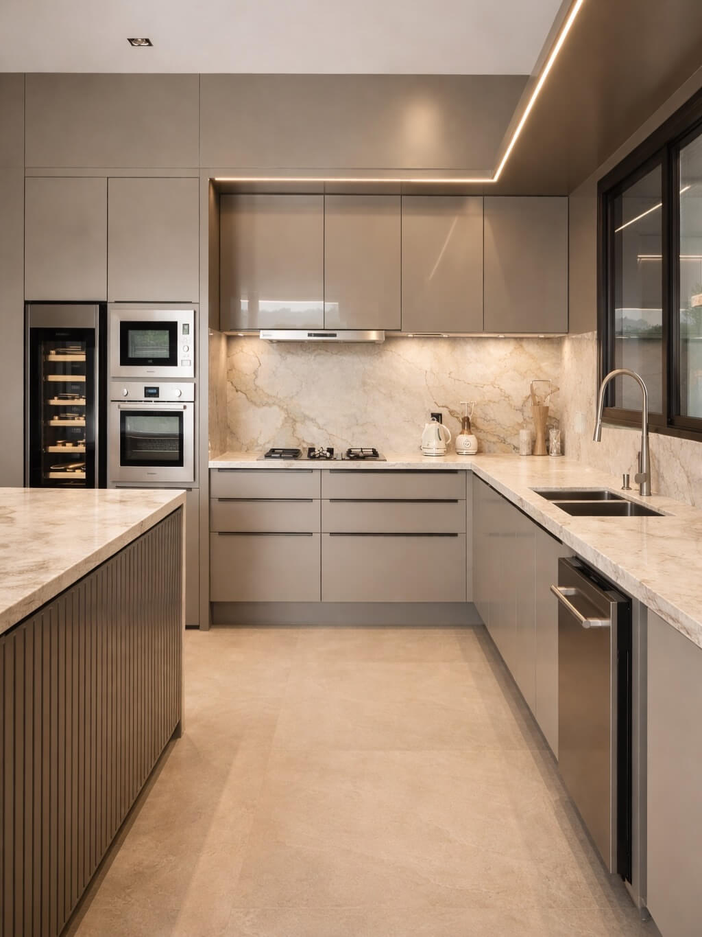
Mushroom is one of those colors that can be difficult to describe until you see it beside white.
It’s not quite beige.
It’s not quite gray.
Depending on the shade, you may notice brown, taupe, or a slightly earthy undertone.
That’s what makes it useful.
Mushroom, putty, greige, and taupe can give cabinetry more presence without becoming the loudest thing in the kitchen.
They can look especially good when the room already contains stone, warm metal, or natural wood.
But these colors need testing.
A taupe that looks warm on your phone may turn surprisingly cool beside the flooring.
Another may bring out a pink or purple undertone you never noticed until it meets the countertop.
Try samples beside both.
Then walk away and look again from the kitchen doorway instead of inspecting the color from six inches away.
If the cabinetry feels connected to the room rather than pasted onto it, you’re getting closer.
And if you’re ready for more color, green is a natural next move.
Deep Green Cabinets Can Make a Kitchen Feel More Custom
Green can behave almost like a neutral when you choose the right version.
I’m not talking about one generic “green kitchen.”
Olive feels different from forest green.
Moss feels different from sage.
A muddy green can look earthy and quiet, while a deep green can become the strongest feature in the room.
Start by deciding how much attention you want the cabinetry to receive.
If you have beautiful stone you want to show off, a quieter green may make more sense.
If the countertop and backsplash are simple, deeper green cabinetry can take the lead.
Wood is worth looking at here too.
Put the green sample beside cutting boards, flooring, stools, or other wood already present in the kitchen.
Then add the hardware you’re considering.
You’ll start seeing the combination rather than the paint color alone.
If painting every cabinet green feels like too much, don’t.
Try it visually on the island or lower cabinets first.
That gives you color without asking the entire room to carry it.
Blue can work in much the same way, but it creates a different mood.
Navy and Inky Blue Add Depth Without Going Fully Black
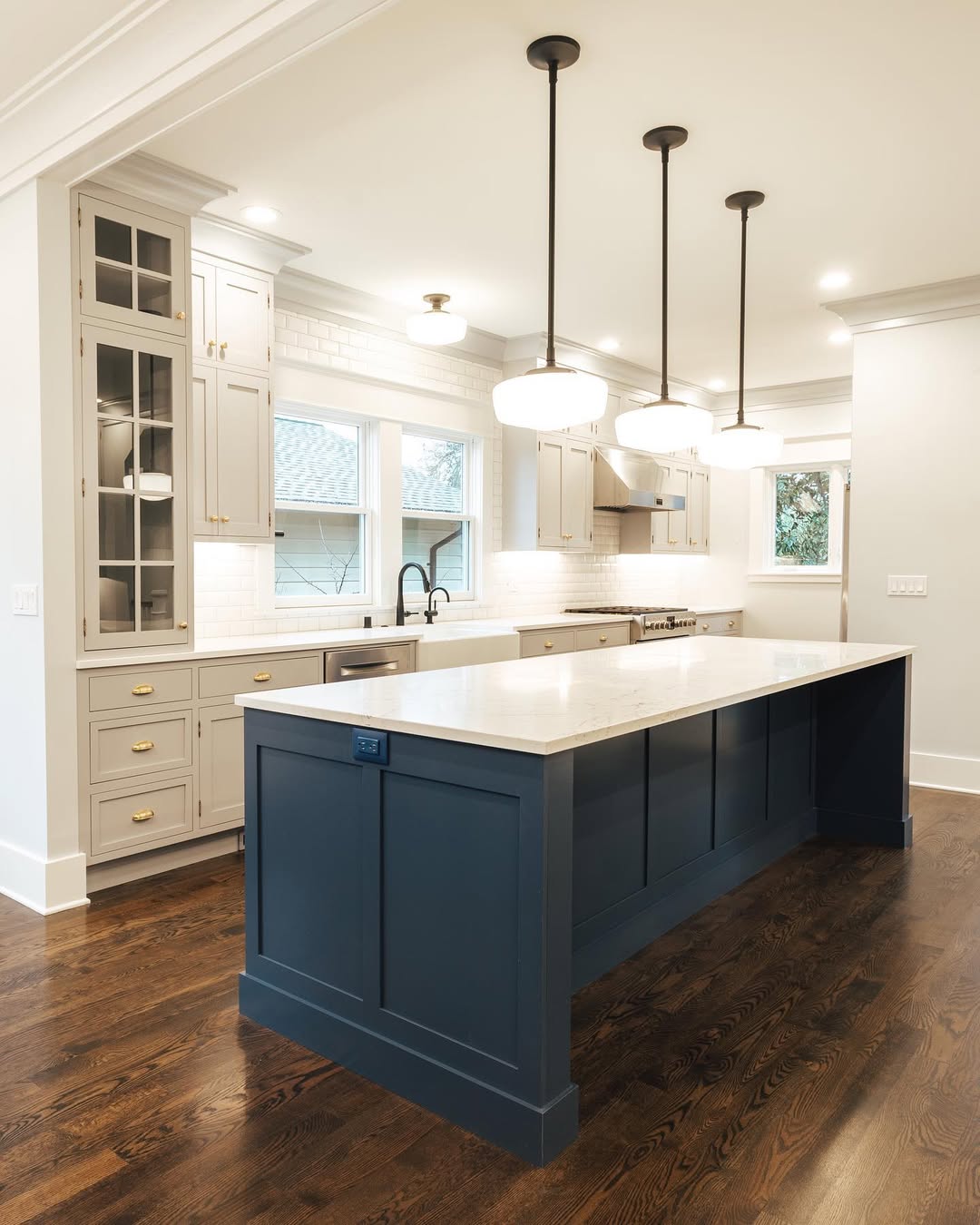
Deep blue is useful when you want contrast but black feels too severe.
Navy can read polished and familiar.
Inkier blues can feel moodier.
Muted blue can sit somewhere between a statement color and a neutral.
The tricky part is that deep colors change dramatically with light.
A navy that clearly looks blue beside a sunny window may appear almost black on cabinetry across the room.
So don’t test it only in the nicest patch of daylight.
Move your sample to the darkest cabinet area.
Check it in the morning.
Check again late in the day.
Then turn on the kitchen lights and look one more time.
If you’re nervous about making the whole room dark, use blue selectively.
An island can carry it.
Lower cabinets can carry it while uppers stay lighter.
A bank of tall cabinetry can become the darker feature while the rest of the kitchen remains quiet.
And if blue still feels cooler than what you want, brown is worth another look.
Brown Cabinets Are Coming Back Without Looking Dated
I understand why brown cabinetry makes some people nervous.
Certain reddish-brown finishes immediately bring older kitchens to mind.
But brown doesn’t have to mean that.
Think chocolate.
Espresso.
Walnut-inspired shades.
Soft earthy browns.
These colors can make cabinetry feel grounded, especially when lighter countertops or backsplashes give them some contrast.
Before choosing brown paint, though, look at how much warmth the kitchen already contains.
If you have warm flooring, wood furniture, brown stone, and brass hardware, another strong brown may push the room farther than you want.
You might need contrast instead.
If the kitchen is filled with pale or cool surfaces, brown cabinetry can supply some of the warmth that’s missing.
And don’t forget the obvious alternative.
If you already have good wood cabinets, painting them brown may make less sense than letting the wood itself do the work.
Natural Wood May Be Better Than Another Paint Color
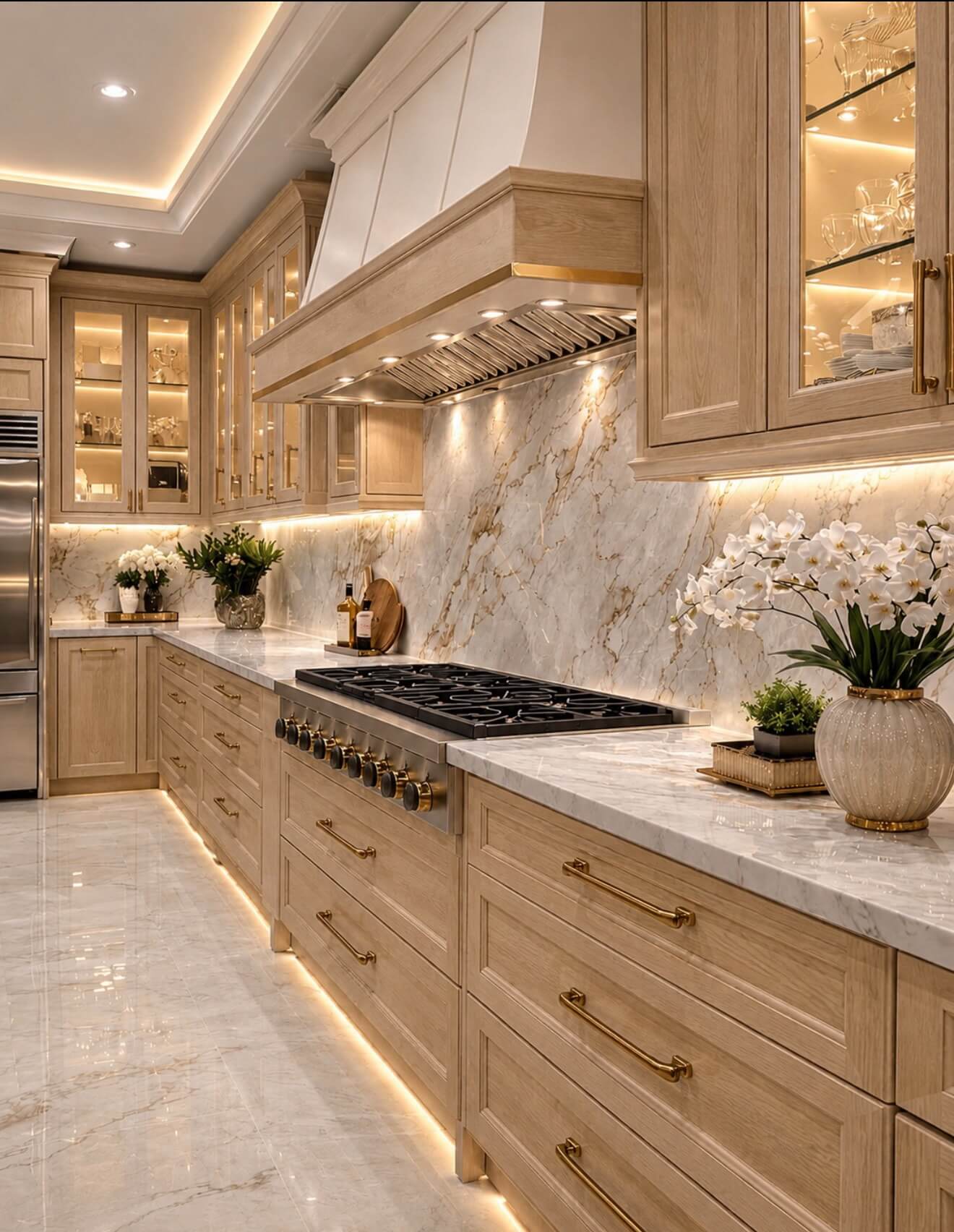
Not every kitchen needs painted cabinets.
If your cabinets are real wood, stop before reaching for the paintbrush.
Look at the grain.
Look at the tone.
Then imagine the room with that wood cleaned up, refinished, or paired with different hardware and surrounding colors.
Natural wood brings something paint can’t imitate perfectly.
Variation.
Grain.
Texture.
Warmth.
That can be useful in kitchens filled with smooth countertops, painted walls, stainless steel, and glossy tile.
You can also mix wood with painted cabinetry.
A wood island with painted perimeter cabinets can create contrast.
So can wood lower cabinets beneath lighter uppers.
The goal isn’t to use every material available.
It’s to decide whether the wood deserves to stay visible before covering it.
If you want even stronger contrast, black becomes another possibility.
Black Cabinets Need the Rest of the Kitchen to Support Them
Black cabinetry can look incredible.
It can also swallow a kitchen that doesn’t have enough light or contrast around it.
Before choosing black, photograph your kitchen at the darkest time you normally use it.
Not noon on a sunny day.
Try early morning or evening.
Look at how much natural and artificial light actually reaches the cabinetry.
Then look at the surrounding surfaces.
A lighter countertop can give black cabinetry room to breathe.
A pale backsplash can create separation.
Warm wood can keep the combination from feeling too hard.
And you don’t necessarily need true black.
Charcoal, softened black, or very deep brown can give you much of the same drama while revealing more nuance in changing light.
Small kitchen?
Try the darker color on lower cabinets or an island before surrounding the entire room with it.
That brings us to one of the easiest ways to use more than one cabinet finish successfully.
Two-Tone Cabinets Work Best When the Split Makes Sense
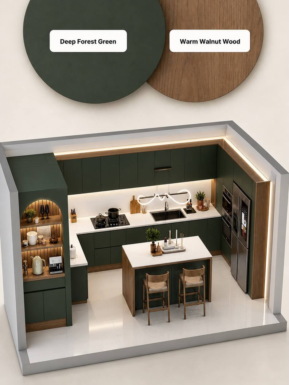
Two cabinet colors can make a kitchen more interesting.
They can also make it look chopped up.
The difference usually comes down to where the change happens.
Dark lowers with lighter uppers make visual sense because the heavier color stays closer to the floor.
A contrasting island works because the island is already a separate object.
A wall of tall cabinets can take another color because that entire section reads as one block.
Wood paired with painted cabinetry works for the same reason.
What I’d avoid is changing color randomly from cabinet to cabinet.
You want the eye to understand why the finish changed.
Take a photo of your kitchen and use it to imagine the split before painting.
Even a rough phone edit can help.
Cover the island digitally.
Darken the lowers.
Look at the tall cabinets as one unit.
Which division feels natural?
Once you’ve narrowed that down, return to the surface sitting closest to the cabinetry.
The countertop.
Match Cabinet Color to the Countertop Before the Wall Paint
If you’re keeping the countertop, give it more influence over the cabinet decision than the wall paint.
Wall paint can be changed relatively easily.
Countertops are another story.
Look closely at yours.
Don’t just decide that it’s white, gray, brown, or black.
What colors actually move through it?
A marble-look surface might have cool gray veining.
Another might have warmer beige or gold movement.
Granite can contain several colors at once.
Butcher block brings an obvious wood tone into the combination.
Tape your cabinet samples directly below the countertop edge.
Now step back.
Which sample makes the countertop look better?
That’s the question I’d ask.
Sometimes you’ll find that a cabinet color you loved on its own makes the countertop look strangely dirty or yellow.
Another color may suddenly make the stone look richer.
That’s useful information.
And the countertop isn’t the only surface touching the cabinetry.
Don’t Ignore the Backsplash
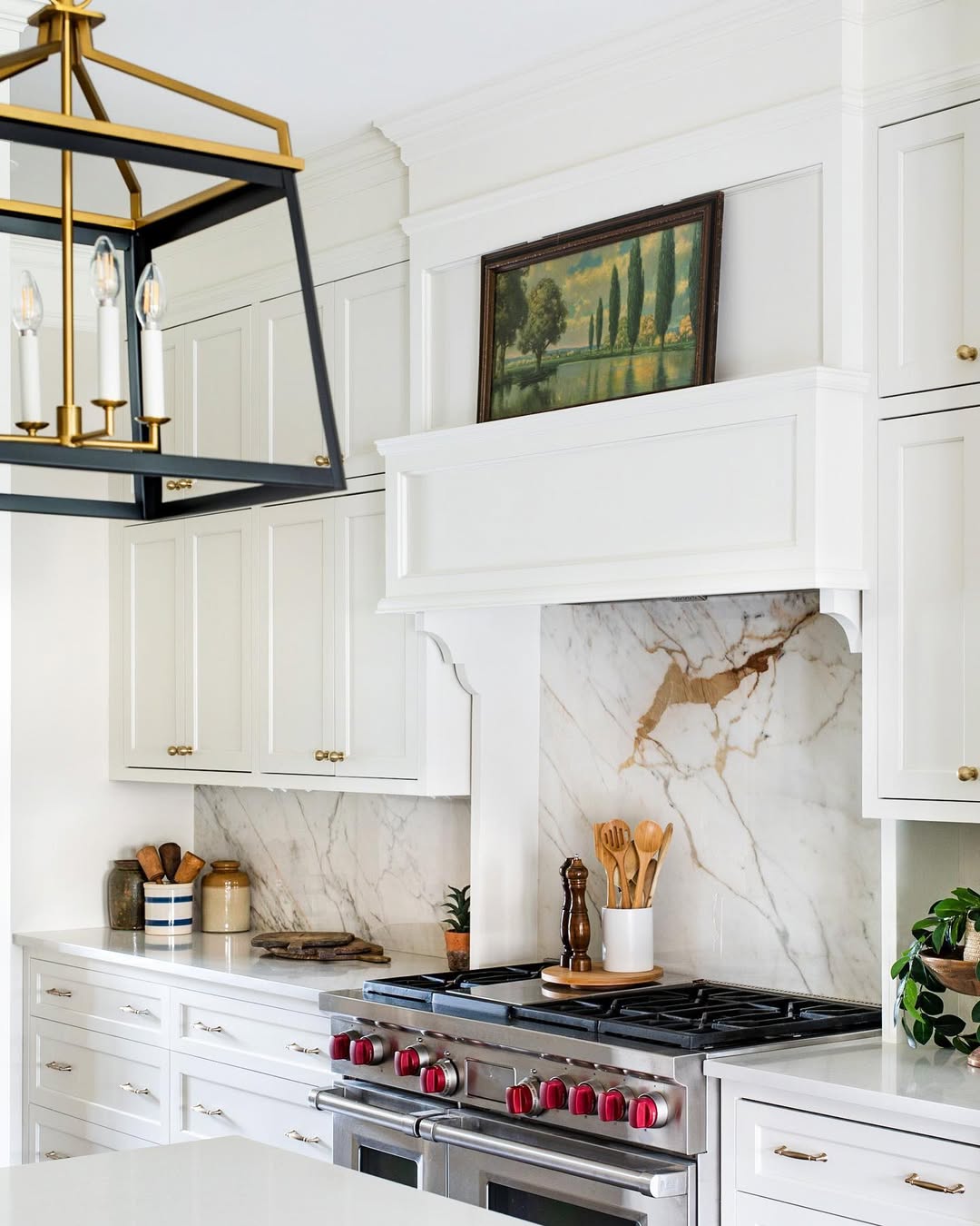
The backsplash can completely change how a cabinet color reads.
This becomes especially noticeable when you’re painting cabinets but keeping existing tile.
Put the sample where the cabinet and backsplash physically meet.
If possible, test more than one location.
Kitchen light isn’t always consistent.
Tile beside the window may look different from tile beneath upper cabinets.
Look at the grout too.
A backsplash may appear neutral until a new cabinet color suddenly pulls out an undertone you hadn’t noticed.
This doesn’t mean the cabinet color has to match the tile.
You just don’t want them arguing with each other.
Once the cabinet, countertop, and backsplash start working together, bring hardware into the picture.
Hardware Can Change the Same Cabinet Color
Take one cabinet color and place brass hardware against it.
Now try black.
Then nickel or chrome.
The paint hasn’t changed, but the combination has.
That’s why I wouldn’t choose cabinet color and hardware in completely separate decisions.
If you’re replacing hardware, buy or borrow one sample pull before ordering the entire kitchen.
Hold it against your painted sample.
Then place both beside the countertop.
A deep green with warm metal can feel very different from that same green with cooler metal.
A warm white can change too.
And you may discover that your existing hardware works perfectly well once the cabinet color changes.
Don’t replace something simply because you’re changing everything around it.
The next variable costs nothing to test.
You just need to wait a few hours.
Your Kitchen’s Light Can Change the Color More Than You Expect
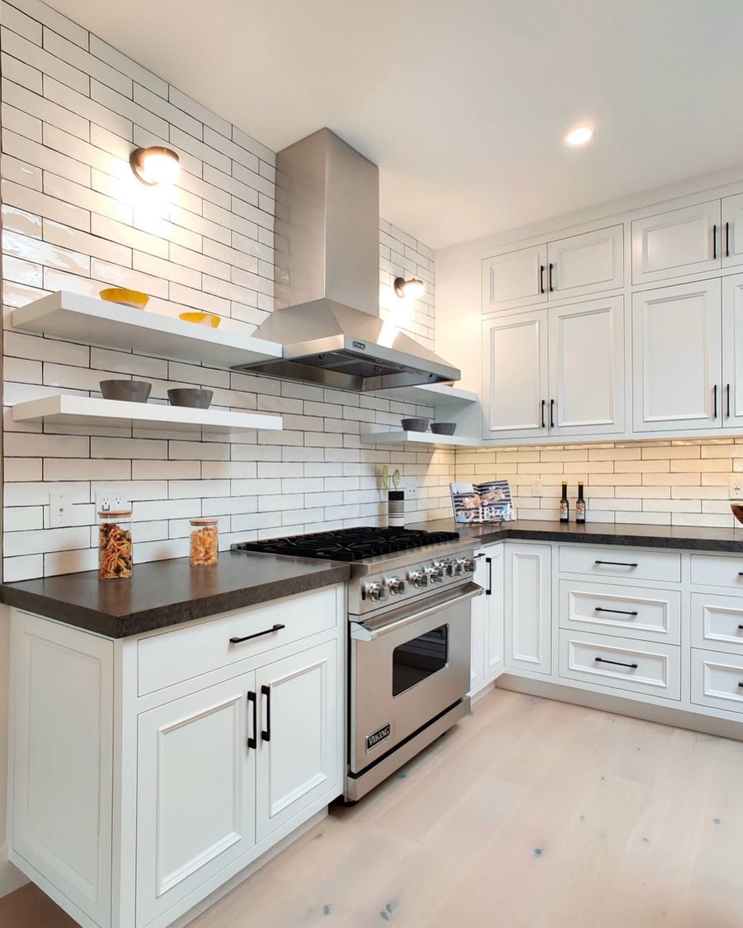
Paint samples are deceptive when you look at them in one place at one time.
Your kitchen isn’t lit that way.
Morning light changes.
Afternoon light changes.
Then daylight disappears and the bulbs take over.
The Spruce recommends testing paint in the actual room rather than trusting a paint chip alone, advising, “Use durable paint finishes, and test the paint in the room; don’t just rely on a paint chip.”
I’d take that seriously with cabinetry.
Make larger sample boards rather than relying on tiny swatches.
Move them around.
Put one near the window.
Move it to the darkest corner.
Place it beside the refrigerator.
Check the island.
Look at the color while you’re making breakfast and again after dinner.
If you only love the shade for two hours in the middle of the day, keep looking.
There’s another testing mistake that’s easy to make.
Test Cabinet Colors Vertically, Not Flat on a Table
Cabinet doors stand vertically.
Your sample should too.
A board lying flat on the countertop receives light differently from a cabinet front.
Paint a decent-sized sample board.
Then tape or prop it vertically against the cabinetry.
Move it from upper cabinets to lower cabinets.
Put it directly beside the backsplash.
Hold the hardware against it.
Stand across the room.
Do the same with your second choice.
I’d narrow the options to two before this stage.
Ten samples taped around the kitchen can become visual noise.
Two finalists make comparison much easier.
Once they’re up, stop staring at the paint itself.
Look at what happens to the rest of the room.
Use the 10-Foot Test Before Choosing
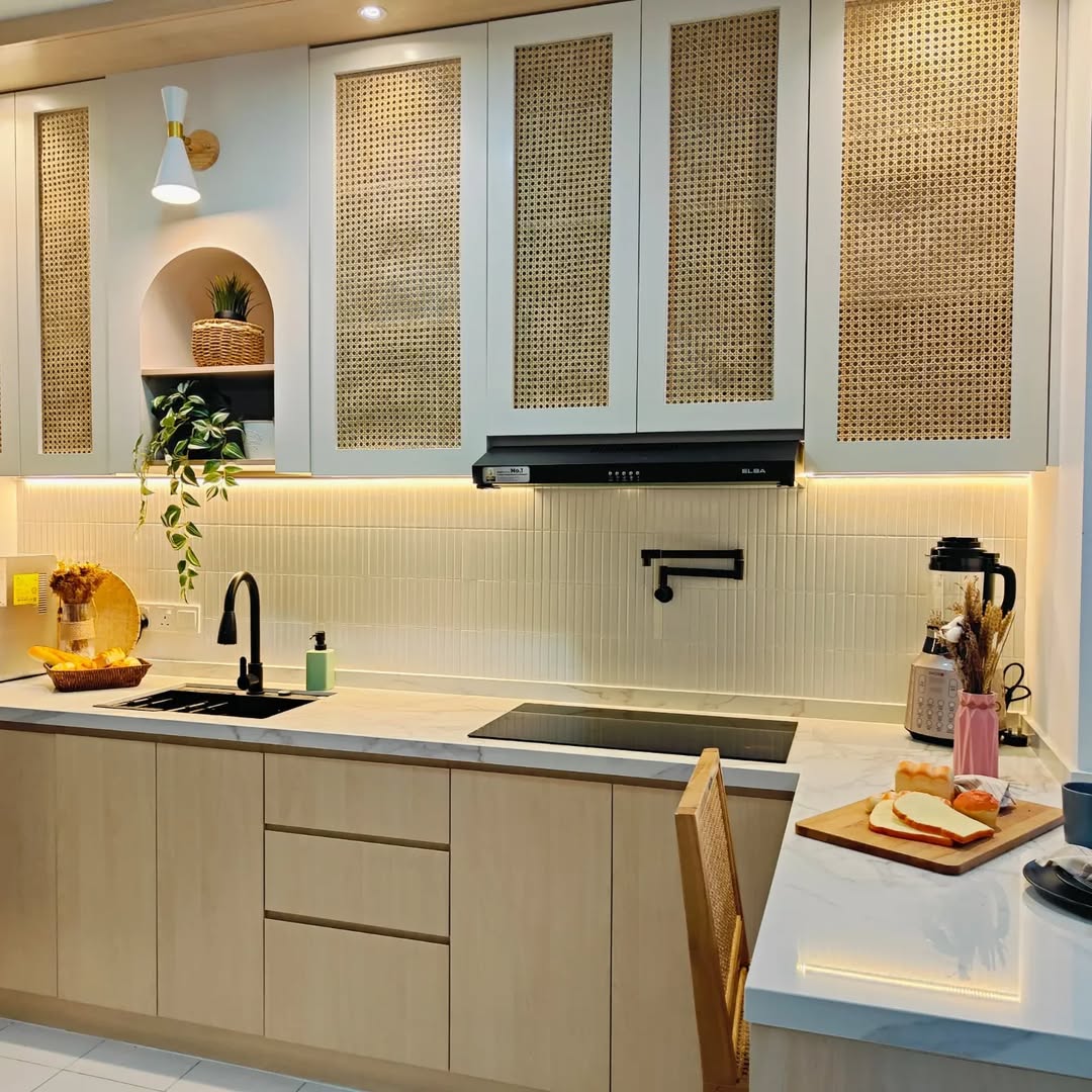
Walk away from the cabinet sample.
Farther.
Look at the kitchen from the dining area, hallway, or wherever you normally enter.
What happened?
Did the cabinetry suddenly become the only thing you see?
Did the countertop disappear?
Does the backsplash look better?
Does the floor look strangely warmer or cooler?
You can miss these relationships when your face is inches from a sample.
A photo can make visual imbalance easier to spot because you see the whole room at once.
If one sample looks beautiful close up but makes the entire kitchen feel disconnected from a distance, it probably isn’t the winner.
And if you’re still nervous about a stronger color, you don’t necessarily have to commit everywhere.
Make the Island Your Color Test
The island is one of the easiest places to let a stronger cabinet color lead.
Maybe you love deep green but aren’t ready for an entire green kitchen.
Try the island.
Maybe navy looks beautiful with your countertop but feels heavy across every wall.
Try the island.
Maybe you want natural wood but don’t want to replace all the cabinetry.
A wood island can introduce it.
This works because the island already reads as a separate piece.
You aren’t inventing a random break in the cabinetry.
You’re giving an existing feature more presence.
Just make sure the stronger color has some relationship with the rest of the room.
It doesn’t need a matching green lamp or navy bar stool.
A smaller repetition through artwork, textiles, or another finish can sometimes be enough.
But restraint matters.
Don’t Let “Expensive-Looking” Become Too Many Finishes
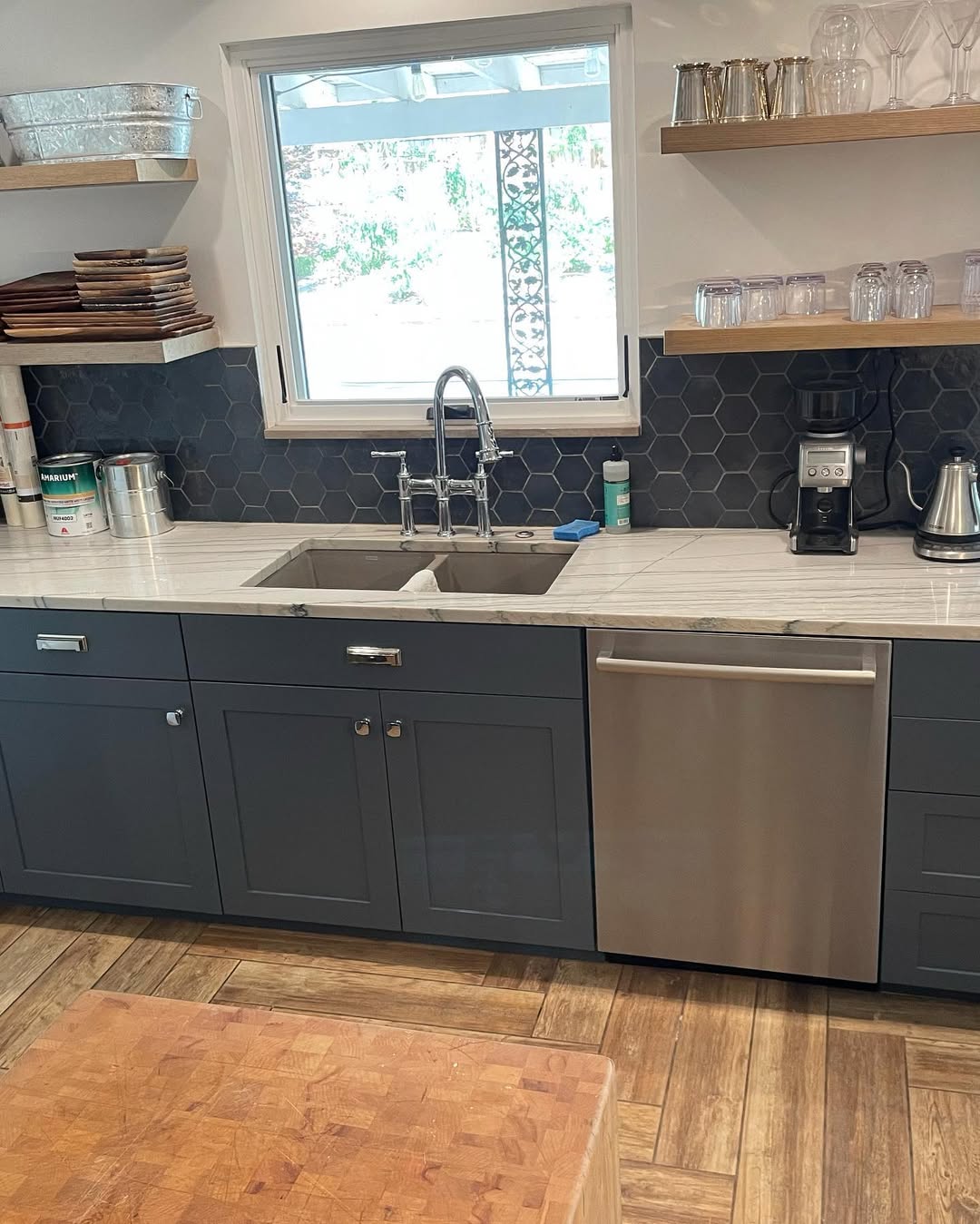
Kitchens already contain a lot.
Cabinets.
Countertops.
Backsplash.
Flooring.
Appliances.
Hardware.
Lighting.
Paint.
Then we start adding stools, rugs, cutting boards, small appliances, and everything that lives on the counter.
You don’t need every surface to make a statement.
Write down the major finishes in your kitchen.
Actually list them.
If you already have dramatic stone, patterned tile, strong flooring, dark appliances, and warm metal hardware, the cabinets may need to quiet things down rather than introducing another competing idea.
This is where expensive-looking rooms often get misunderstood.
More isn’t necessarily richer.
Sometimes the room looks better when one element becomes quieter.
Decide What Should Be the Star of Your Kitchen
What is the best-looking thing in your kitchen?
Maybe it’s the countertop.
Maybe it’s beautiful wood flooring.
Perhaps you have a backsplash you still love.
Or maybe everything else is fairly quiet and the cabinetry deserves to become the feature.
Decide.
Then choose the cabinet color accordingly.
If your stone has dramatic movement, quieter cabinetry can let it lead.
If the countertops and backsplash are simple, green, navy, brown, or black cabinetry may have more room to speak.
House Beautiful makes a useful point in its look at how designers choose custom paint colors.
Designer Krista Wells says, “Sometimes when people describe a space as elegant or expensive, it is because a custom color has been chosen that complements the light, architectural details, and existing materials, textures, and patterns.”
That’s the idea I’d carry through the entire decision.
Don’t ask the cabinet color to look expensive by itself.
Ask it to make the kitchen look better as a whole.
There’s one final way to judge whether you’ve managed that.
Do the Doorway Test Before You Commit
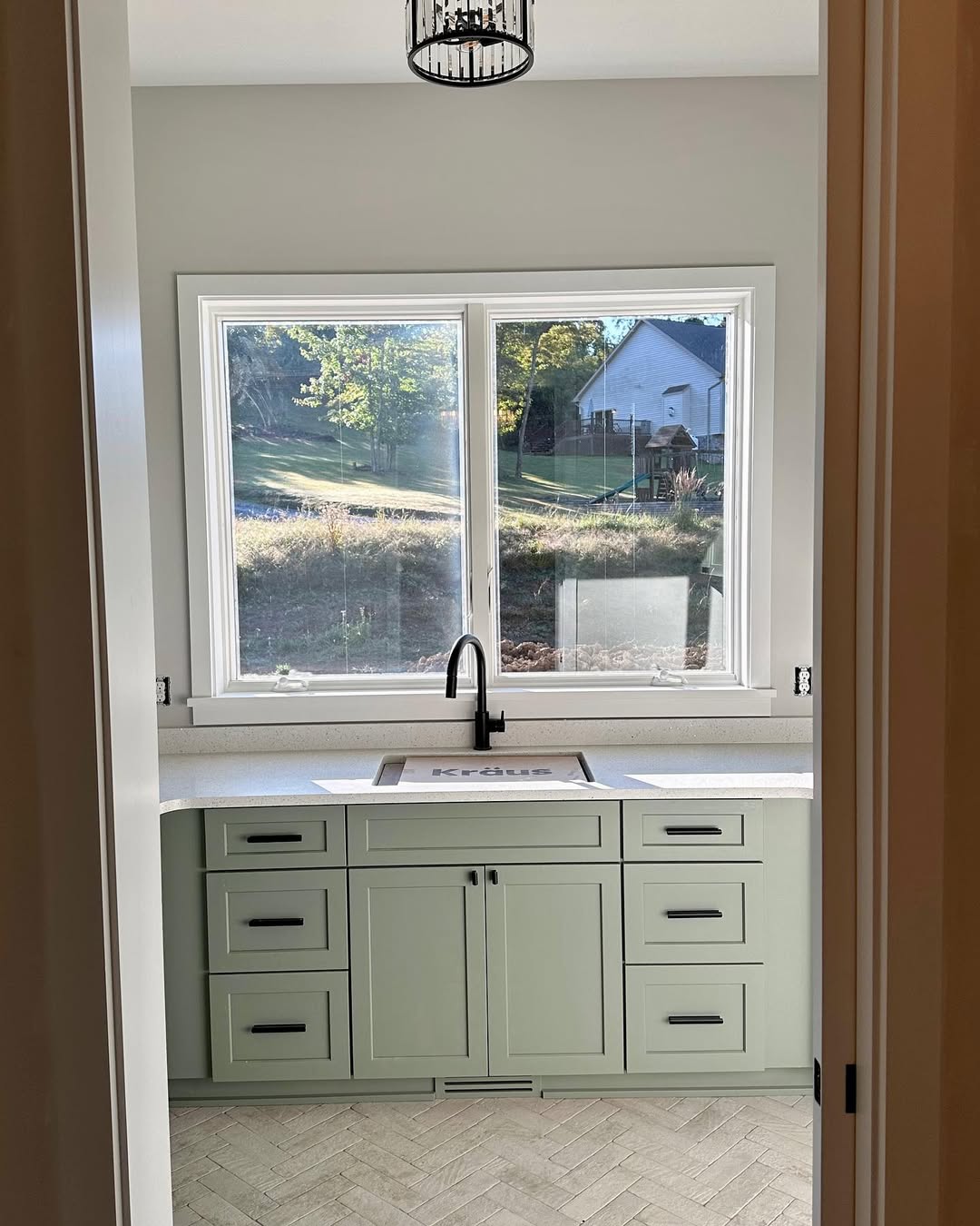
Return to the place where you took your first kitchen photo.
Stand there again with your final samples in position.
Don’t walk toward them.
Look at the whole room.
Where does your eye go first?
Does the cabinet color connect the countertop, flooring, and backsplash?
Did an existing surface suddenly start looking dated?
Does the kitchen feel too dark?
Too pale?
Too warm?
Too cool?
Now photograph each finalist from exactly the same position.
Compare the photos side by side.
Don’t ask which paint color you like more.
Ask which kitchen you like more.
That’s a much better question.
And it brings us back to where we started.
The Most Expensive-Looking Cabinet Color Is the One That Belongs
There isn’t one kitchen cabinet color that automatically makes every kitchen look expensive.
Warm white can be beautiful.
Mushroom and taupe can give neutrals more depth.
Green can bring character.
Navy can add contrast.
Brown can bring warmth.
Black can create drama.
Natural wood may turn out to be better than paint altogether.
But none of those choices exists alone.
Your countertop is sitting right there.
So is the backsplash.
The floor isn’t going anywhere.
Light will keep changing throughout the day.
Hardware will change how the color feels.
That’s why I’d spend less time asking what cabinet color everyone else is choosing and more time testing what makes your kitchen look better.
Start with what you can’t easily change.
Narrow the colors.
Make large samples.
Put them vertically against the cabinetry.
Check them morning and night.
Then stand at the doorway.
The winning color shouldn’t make you notice the cabinets first.
It should make you look at the entire kitchen and think, Now everything makes sense.
Also read: