Hand-Painted Terra Cotta Pots That Look Beautiful, Not Crafty
I’ve always liked terra cotta pots before anything is done to them.
That warm, earthy orange already has character. Put one beside green foliage, let it weather naturally outdoors, and it rarely needs much help.
Which is exactly why hand-painting terra cotta can go wrong so easily.
The temptation is to keep adding.
Another color. Another stripe. Another little pattern. Maybe a decorative border because the middle still feels empty.
Before long, the pot starts looking more like a craft project than something you’d intentionally use in your home or patio.
I’ve learned to approach hand-painted terra cotta pots differently.
Instead of asking, What can I paint on this? I ask, What would make this pot look as though I bought it this way?
Usually, the answer is less.
One good color combination. A simple shape. A repeated pattern. A deliberately unfinished section of terra cotta.
If you’re painting your own pots, don’t begin with the paintbrush.
Put the empty pot where you plan to use it.
Look at everything around it.
That’s where the design should begin.
Start With Where the Pot Will Actually Live
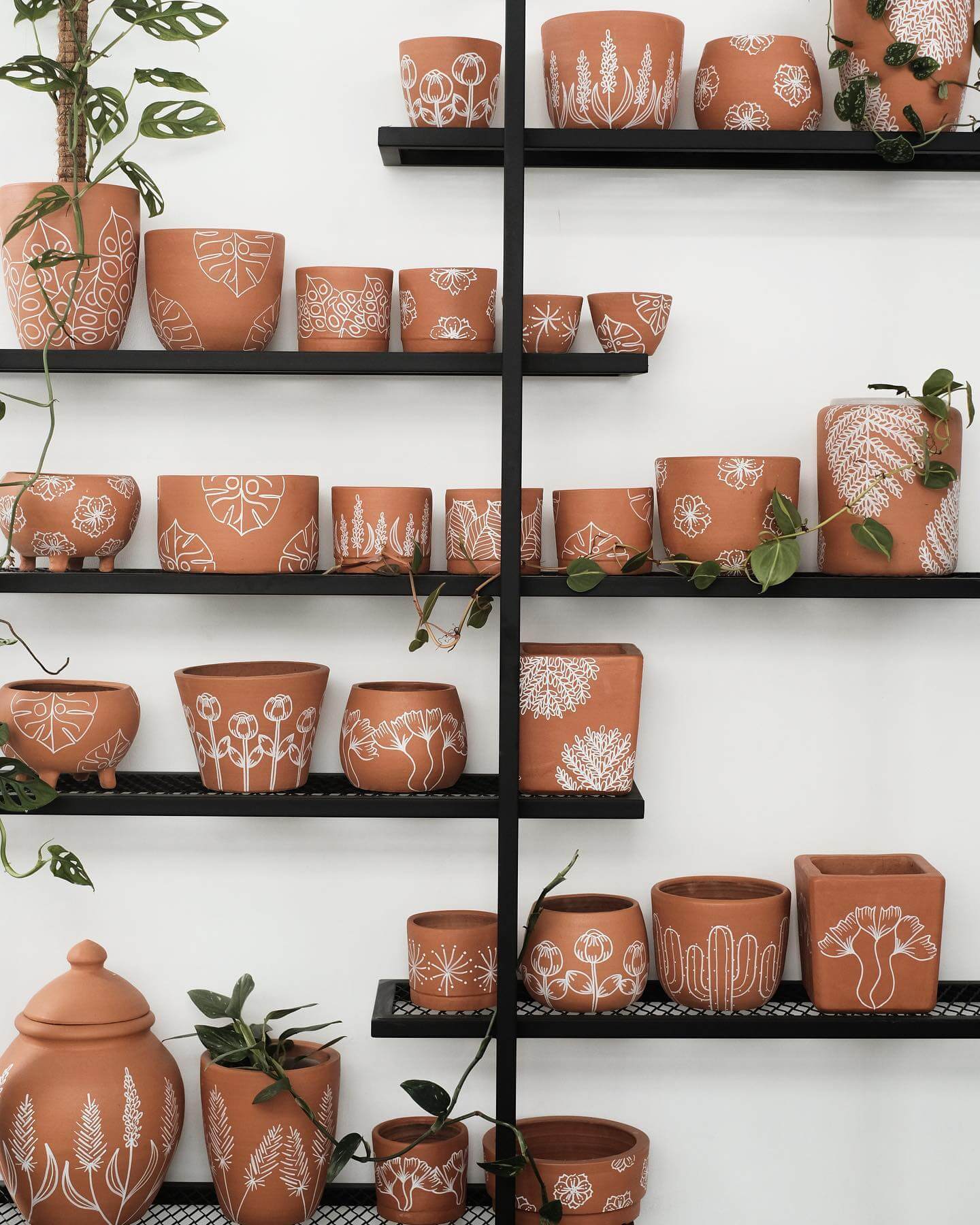
A pot on a sunny patio has different practical and visual demands from one sitting on a bookshelf.
So choose the location first.
Put the unpainted terra cotta pot there.
What’s already happening around it?
Maybe your patio has black metal furniture and cream cushions.
Perhaps your living room contains warm wood, muted textiles, and plenty of green plants.
Your front steps may already have brick, stone, flowers, and a colorful door competing for attention.
The pot doesn’t need to introduce another completely unrelated idea.
Look for something worth repeating.
It might be a color.
A shape.
A material.
Or simply the overall mood.
If the pot will live outdoors, think about exposure before choosing any paint or coating. Use products intended for the surface and location, and follow the manufacturer’s directions for preparation, application, drying, and any protective finish.
Once you understand where the finished pot belongs, you can start thinking about what should happen on its surface.
But first, the pot itself needs some attention.
Prep the Terra Cotta Before Thinking About the Pretty Part
This isn’t the exciting part.
It’s still worth doing.
Don’t take a dusty pot from the garage and immediately start painting it.
Look at the surface.
If it’s an older pot, check for dirt, loose debris, mildew, residue, or anything else that shouldn’t be trapped beneath the finish.
Homes & Gardens recommends starting with a clean surface in its guide to painting an outdoor plant pot, advising, “Remove mud, dust, mildew or mold from the surface before you get started.”
Follow the preparation instructions for the paint or finish you’re planning to use, and give the pot whatever drying time the product requires.
Don’t rush this part because you’re excited about the design.
I’ve found that slowing down before the decorative work usually makes the decorative work easier.
While the pot is drying, use that time to plan your design somewhere else.
Sketch the Design on Paper First
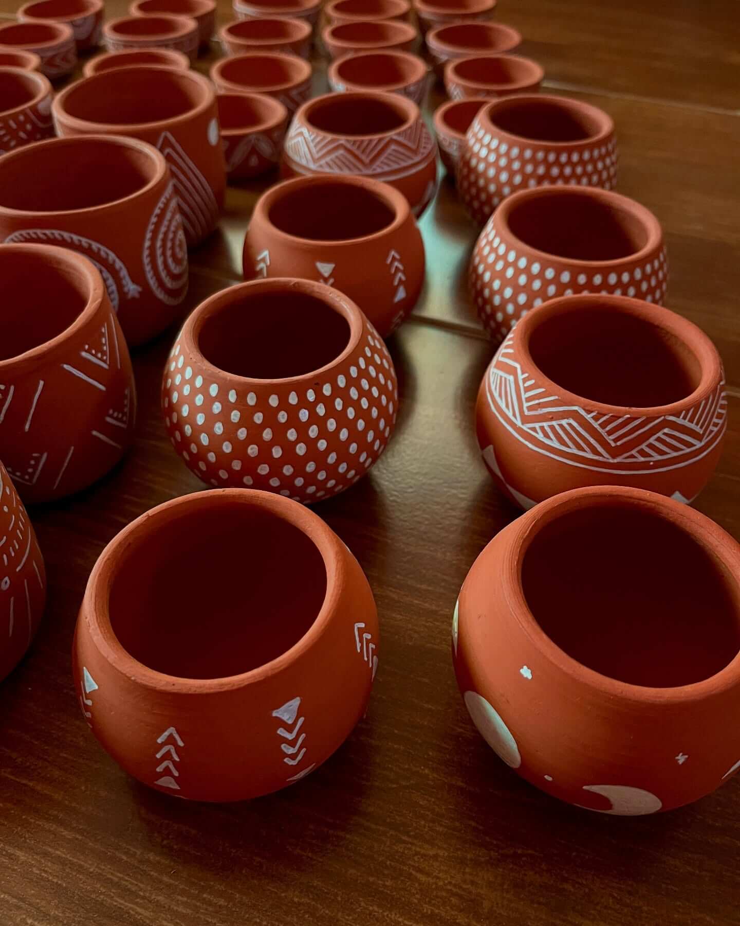
You don’t need artistic skills for this.
Draw the rough shape of the pot on a piece of paper.
It can be terrible.
Mine usually is.
You’re not making art. You’re testing proportions.
If you’re considering a wide painted band around the bottom, draw it.
Thinking about a narrow stripe near the rim?
Add that.
Maybe you want one side painted while the other stays natural.
Sketch it.
Now make three versions.
The first can be your original idea.
Make the second simpler.
Then simplify it again.
This is one of my favorite ways to avoid overdecorating because the design that looked almost too plain on paper often looks just right once it’s wrapped around a three-dimensional pot and placed beside a plant.
Remember, the pot won’t be sitting alone on a white table.
There will be soil.
Leaves.
Furniture.
Other pots.
Maybe flowers.
The design doesn’t need to provide all the visual interest by itself.
That’s also why I wouldn’t rush to cover every inch of terra cotta.
Let Some of the Original Terra Cotta Show
You bought a terra cotta pot.
Let it look like one.
That warm natural surface can become one of the colors in your design.
Instead of painting the entire pot cream and then adding brown details, you might leave part of the original clay exposed and use cream only where it matters.
Try painting the lower third.
Or the upper section.
Leave a natural band between two painted areas.
Paint a simple shape on one side while allowing most of the pot to remain untouched.
This immediately reduces the number of colors you need.
It also creates contrast between the earthy clay and the painted surface.
Before painting, use painter’s tape where it’s suitable to visualize the division.
Tape off the approximate section and place the pot where it will live.
Does the proportion look right?
Move the tape until it does.
If the design already feels interesting with nothing but tape and natural clay, you’re probably on the right track.
Choose a Small Color Palette and Let One Shade Lead
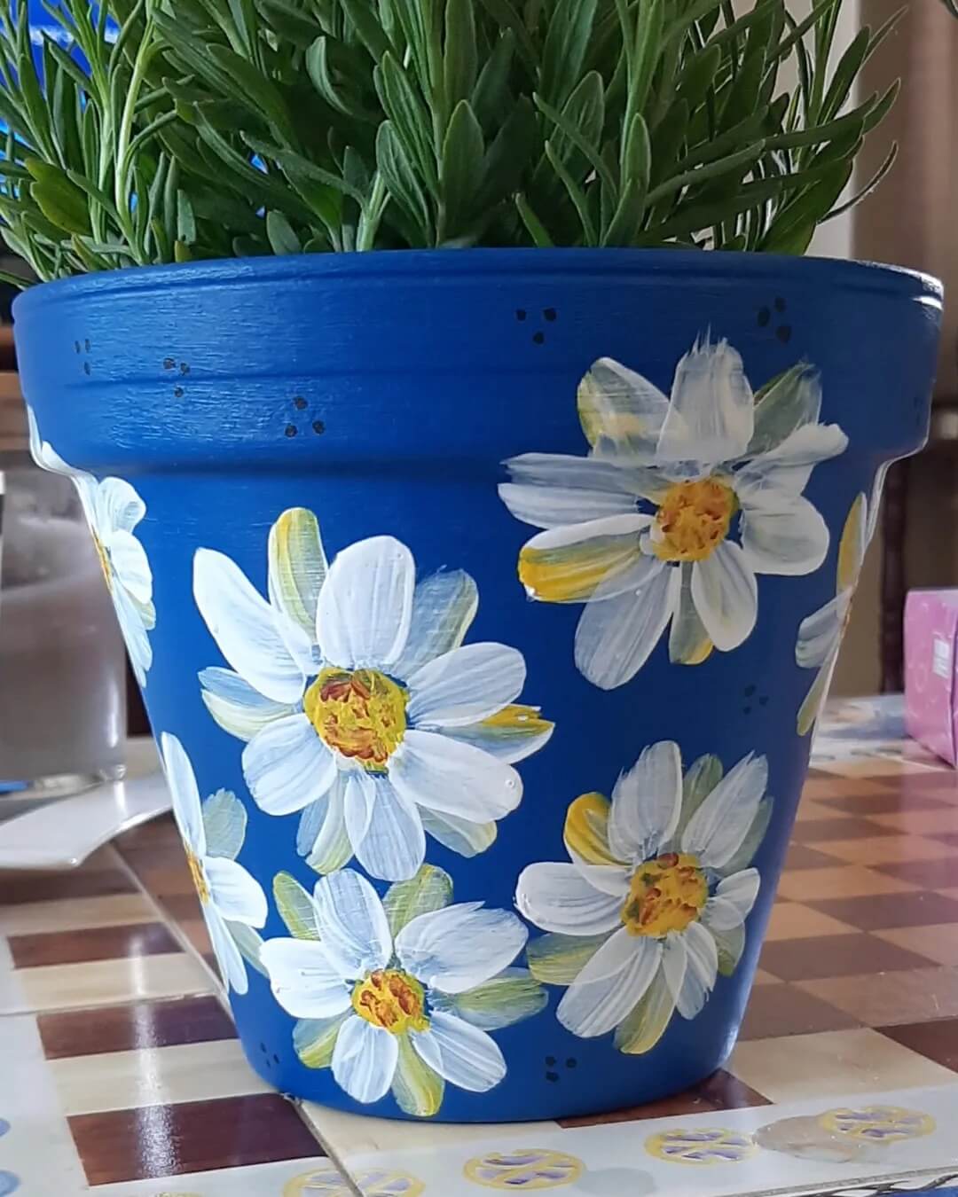
More colors don’t automatically make a hand-painted pot more interesting.
They make it harder to control.
I’d begin with two.
The terra cotta itself can count as one of them.
That might mean natural clay plus cream.
Terra cotta plus muted green.
Clay plus black.
Maybe you’re using two painted colors alongside the natural pot.
Before committing, bring the colors to the room or patio where the pot will live.
Don’t judge them in isolation.
Ask what they’re doing with everything else.
If your patio already has black metal furniture, a small black detail on the pot might be enough to connect them.
If your room contains warm whites and natural wood, cream against the terra cotta may feel more at home.
And if your plant will eventually produce colorful flowers, remember those flowers will become part of the palette too.
Once you have the colors, don’t use them equally.
Choose one to lead.
A pot mostly left natural with one broad cream section and a thin black line usually feels calmer than one split evenly between several competing shades.
Think of the accent color as punctuation.
It should finish the idea rather than fight for attention.
The same restraint works with patterns.
Use Simple Patterns You Can Repeat Consistently
You don’t need to paint an elaborate botanical illustration to create a beautiful pot.
Simple shapes can look much more intentional.
Stripes.
Dots.
Arches.
Loose lines.
Blocks.
Small repeating marks.
The trick is choosing a pattern you’re comfortable repeating.
Before touching the pot, practice on paper.
Paint several versions of the shape.
Do they look reasonably related?
They don’t need to be identical.
Slight variation can be part of the charm of something hand-painted.
But there’s a difference between charming variation and a pattern that changes completely halfway around the pot.
If consistency is difficult, simplify the shape.
A line may work better than a leaf.
A dot may work better than a detailed flower.
A broad band may look better than either.
I’d rather execute a simple idea confidently than struggle through an elaborate design that never feels quite finished.
And there’s another option that requires almost no detailed painting at all.
Try Color Blocking Before Detailed Painting
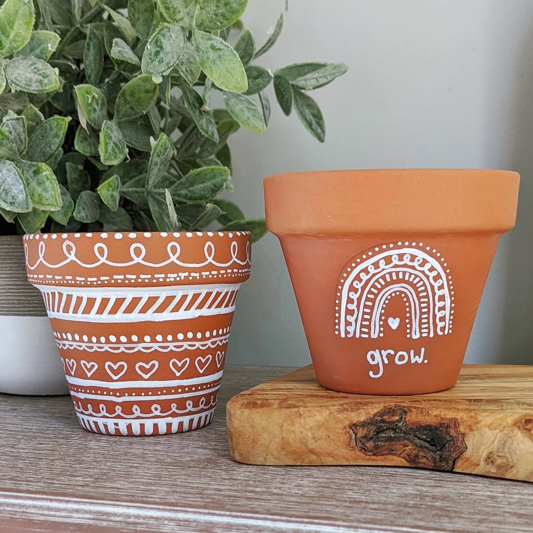
If you’re nervous about hand-painting designs, start with sections.
Color blocking can give a plain pot a strong graphic look without asking you to paint tiny details.
You might paint the lower half and leave the upper half natural.
Try one wide vertical section.
Paint the body while leaving the rim terra cotta.
Or reverse it.
Before choosing, use tape to mock up the division where appropriate.
Then look at the pot from every side.
Pots are three-dimensional.
A design that looks balanced from the front can become awkward as it wraps around the back.
Rotate the pot slowly.
Where does the painted area begin and end?
If the pot will sit against a wall, you can prioritize the view you’ll actually see.
If it will sit in the middle of a table, the design needs to work from several directions.
That becomes especially useful when you’re considering an asymmetrical design.
Make Imperfection Look Intentional
Hand-painted doesn’t have to mean machine-perfect.
I actually think it loses some charm when you’re trying too hard to make every brushstroke invisible.
If you’re painting loose lines, let them be slightly loose.
If you’re making dots by hand, tiny differences are fine.
If a painted edge is meant to look organic, don’t spend an hour forcing it into mathematical precision.
The important distinction is intention.
One slightly imperfect stripe looks handmade.
Seven unrelated mistakes can make the design look unfinished.
Decide where precision matters.
A crisp color-blocked section may benefit from a cleaner edge.
A loose botanical mark doesn’t necessarily need one.
That balance is what keeps the pot from looking overly manufactured without making it feel accidental.
And before adding another decorative element to fix an imperfection, put the pot down.
Use the Three-Foot Test Before Adding More
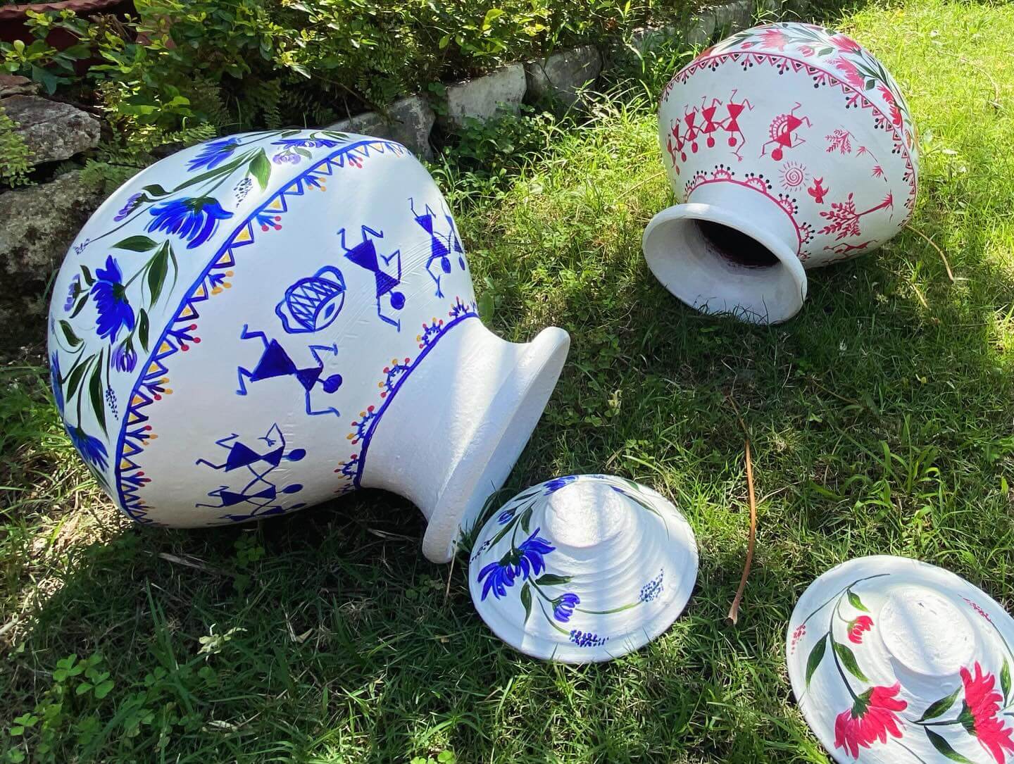
Put the pot where it will live.
Walk a few feet away.
Now look at it.
Can you even see the tiny flaw you were about to fix?
Probably not.
More importantly, does the design look finished from that distance?
If yes, stop.
Don’t add another stripe because the pot looks slightly empty when it’s six inches from your face.
Nobody experiences a planter that way.
They’re going to see the pot beneath a plant, beside furniture, on a patio, near other objects.
Judge it in context.
If the pot has a clear visual idea from a normal viewing distance, you’ve probably done enough.
Now you can start thinking about the thing that matters more than the painted pattern.
The plant.
Let the Plant Influence the Design
A pot doesn’t stay empty.
So don’t design it as though the plant won’t become half the composition.
Think about what you’re putting inside.
A trailing plant will soften the rim and partially cover the upper section.
A tall architectural plant may leave the entire pot visible.
Colorful flowers can become the brightest part of the arrangement.
Dense green foliage may create a beautiful contrast against a lighter painted surface.
Before painting a detailed design around the rim, imagine what happens when leaves start spilling over it.
Will you still see your work?
Maybe that matters.
Maybe it doesn’t.
You can also use the plant to balance the design.
A visually busy plant often looks good in a quieter pot.
A simpler plant can handle a little more pattern.
Terra cotta also affects how moisture moves through the container.
Better Homes & Gardens shares garden expert Kallie Fleming’s advice in its guide to growing lemon trees in pots: “Terra-cotta planters breathe and let a lemon tree dry out in a way that plastic, ceramic, or acrylic pots do not.”
That’s a good reminder not to think only about the painted exterior.
The pot still has a job to do.
Don’t Let Paint Interfere With the Pot’s Job
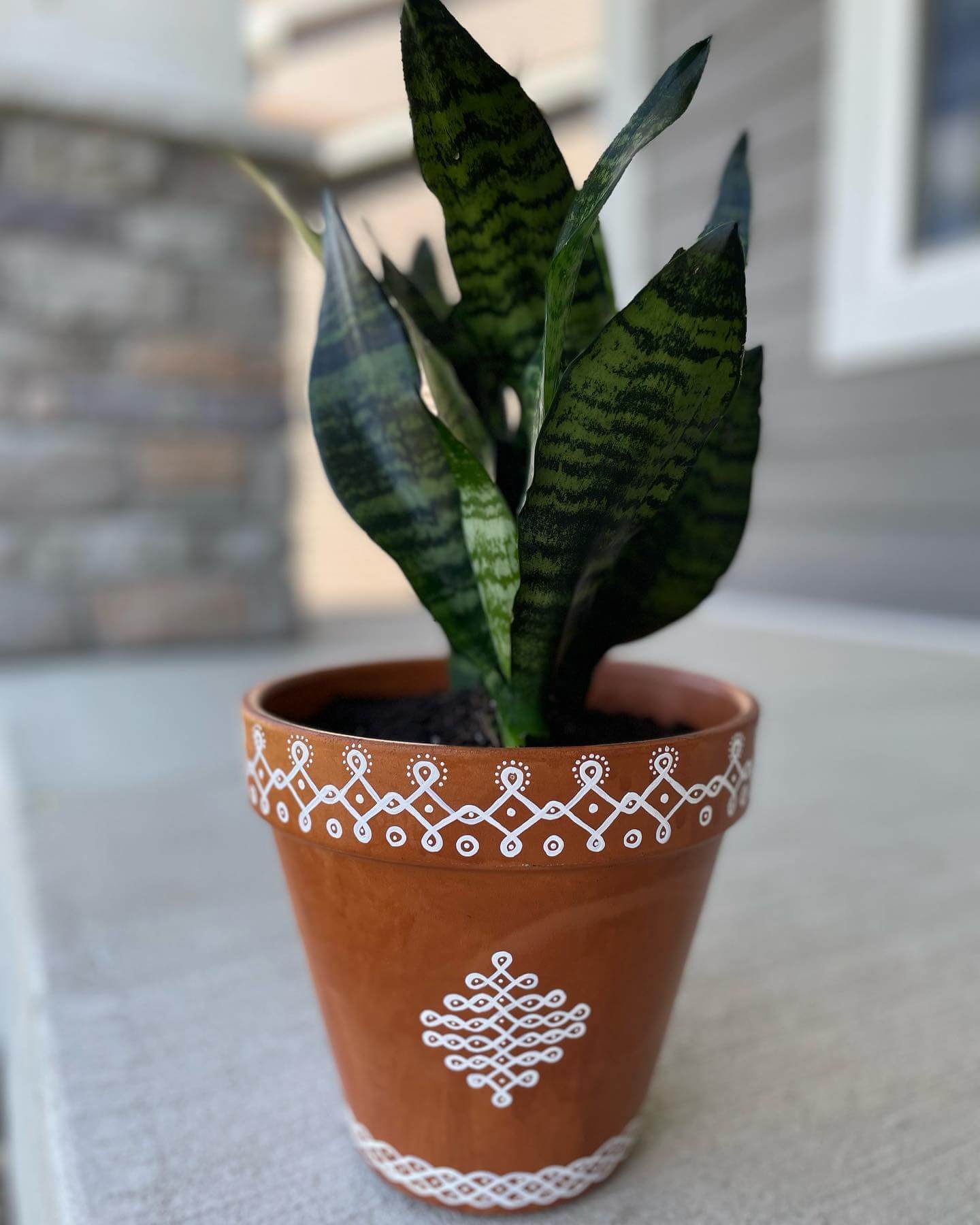
This is where I’d temporarily forget about aesthetics.
Look at the bottom of the pot.
Does it have drainage?
How will water leave?
Where will that water go?
Martha Stewart’s guide to common terracotta pot mistakes gives a straightforward rule: “If your terracotta pot doesn’t have drainage holes, then don’t plant anything directly into it.”
That’s worth thinking about before you fall in love with a decorative container that isn’t suitable for direct planting.
If you want to use a pot without drainage for decorative purposes, an inner plant pot with appropriate drainage may be the better setup.
Whatever painting, sealing, or finishing approach you’re considering, follow the product directions and think about how the pot will actually be used.
A beautiful painted pot isn’t successful if maintaining the plant inside becomes unnecessarily difficult.
Once function is sorted, you can start having more fun with how several pots work together.
Paint a Collection Without Making Every Pot Match
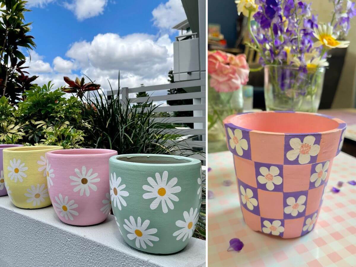
Three identical pots painted identically can look neat.
They can also look a little too coordinated.
I’d rather create a family.
Choose one thing that connects them.
Maybe every pot uses cream.
Perhaps they all include a black detail.
Maybe the same stripe appears differently on each one.
Or you use the same two colors while changing the proportions.
Picture three terra cotta pots.
One has a cream lower half.
Another has a cream rim.
The third has a simple cream stripe.
They’re related without being copies.
This works especially well when the pots themselves are different sizes.
The largest can carry the strongest design.
The smallest might need almost nothing.
Arrange the empty pots together before painting all of them.
You may realize that what looked understated individually becomes plenty once three designs sit side by side.
That matters even more on a small patio.
Use Painted Pots to Do More of the Decorating
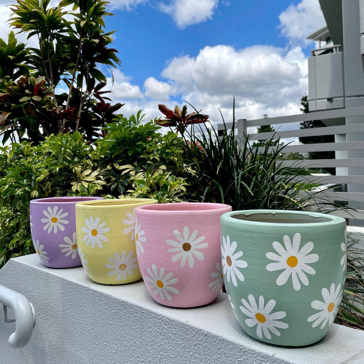
Small outdoor spaces don’t have room for endless decorative objects.
That’s why I like making practical things carry some of the personality.
You’re going to have planters anyway.
Let them do some decorating.
Instead of adding signs, sculptures, lanterns, and several other accessories, a small group of painted pots can provide color and character without taking up extra floor space.
Try clustering three pots of different heights.
Put the tallest toward the back.
Bring a smaller one forward.
You may find that variation in height creates enough interest before you’ve added any complicated patterns.
And don’t assume every pot needs paint.
One or two painted pots among several natural terra cotta containers can have much more impact.
The natural clay gives the eye somewhere quiet to rest.
Mix Painted and Unpainted Terra Cotta
If you have six terra cotta pots, you don’t need six projects.
Paint two.
Leave four alone.
Now arrange them together.
The painted pots become accents rather than the entire story.
This works especially well if your patio already contains plenty of color from plants, cushions, flowers, or furniture.
Natural terra cotta behaves almost like a neutral in the grouping.
Try putting the strongest painted pot near the place you want people to notice.
Maybe that’s beside a chair.
Perhaps it’s near the patio door.
A smaller painted pot could repeat the idea farther away.
You don’t need every planter shouting for attention.
And indoors, that restraint becomes even more useful.
Make Painted Terra Cotta Work Indoors
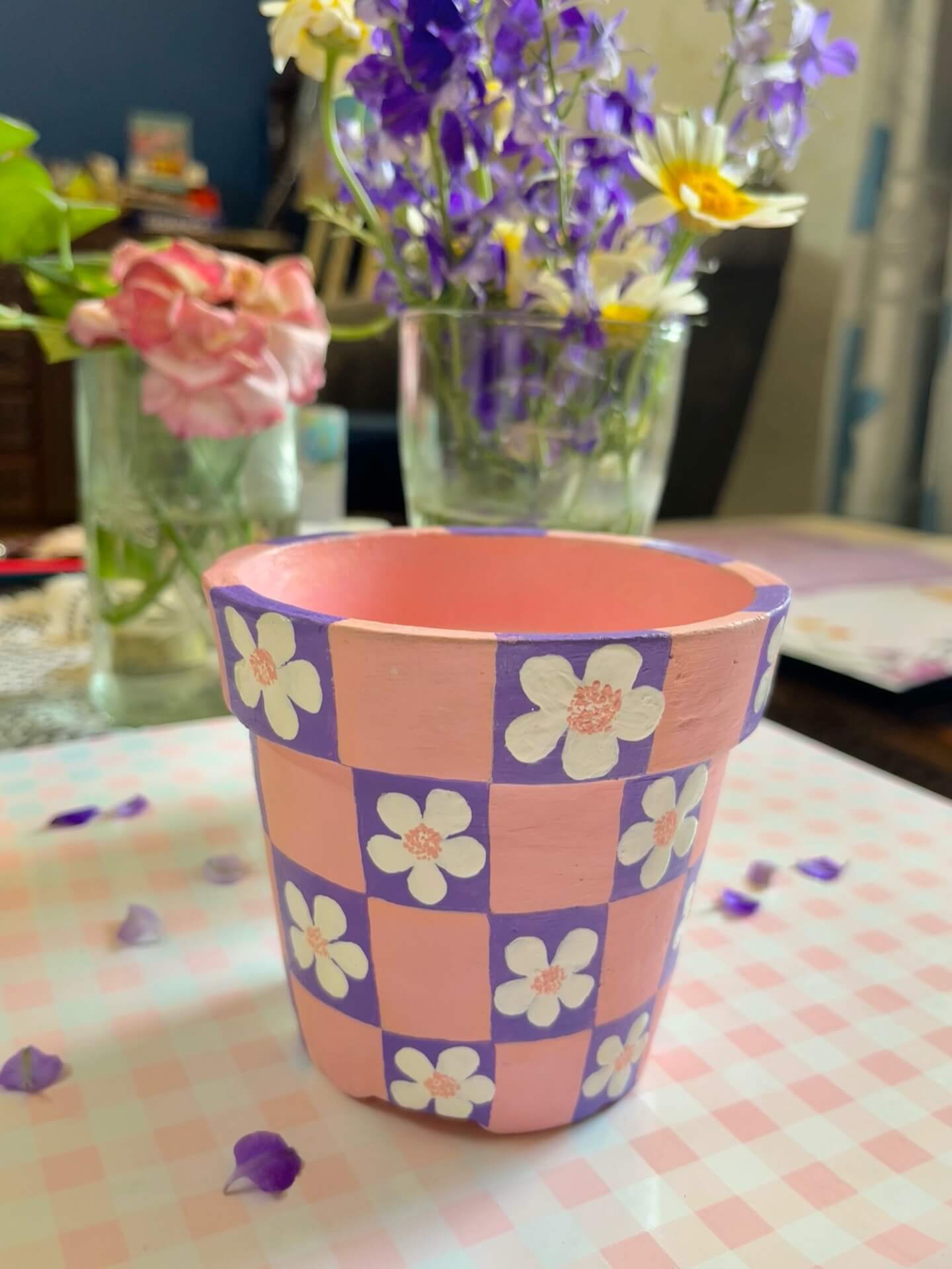
Hand-painted pots don’t have to live on a patio.
They can bring warmth to indoor spaces too.
But I’d make the design respond to the room.
Look at your bookshelf.
Desk.
Kitchen window.
Console.
Bathroom shelf.
Where could a small plant actually live comfortably without making the surface harder to use?
Start there.
Then look at the surrounding colors.
Indoors, I usually prefer quieter painted designs because you’re seeing them much closer.
A cream band.
A simple black line.
A muted green section.
Maybe a tiny repeated mark.
You don’t need the pot to announce itself from across a garden.
It can be a small detail you notice when you walk past.
If you’re using a terra cotta pot indoors, also think carefully about water and protecting the surface underneath it.
The practical setup matters just as much as the painted design.
Repeat One Detail Without Repeating the Whole Pot
Suppose you painted a small cream stripe around a terra cotta pot in your kitchen.
You don’t need the exact same pot in the living room.
Maybe another planter there has a larger cream section.
On the patio, a third uses the same color in a different proportion.
Now there’s a thread.
It’s subtle.
Nobody needs to consciously notice it.
But the pieces begin feeling as though they belong to the same home.
You can repeat shapes too.
Maybe you’re using simple arches.
Or black dots.
Or loose white lines.
Keep one element consistent while allowing the rest to change.
That gives you connection without turning the collection into a matching set.
And before starting the next pot, I’d live with the first for a little while.
Paint One Pot Before Painting the Whole Collection
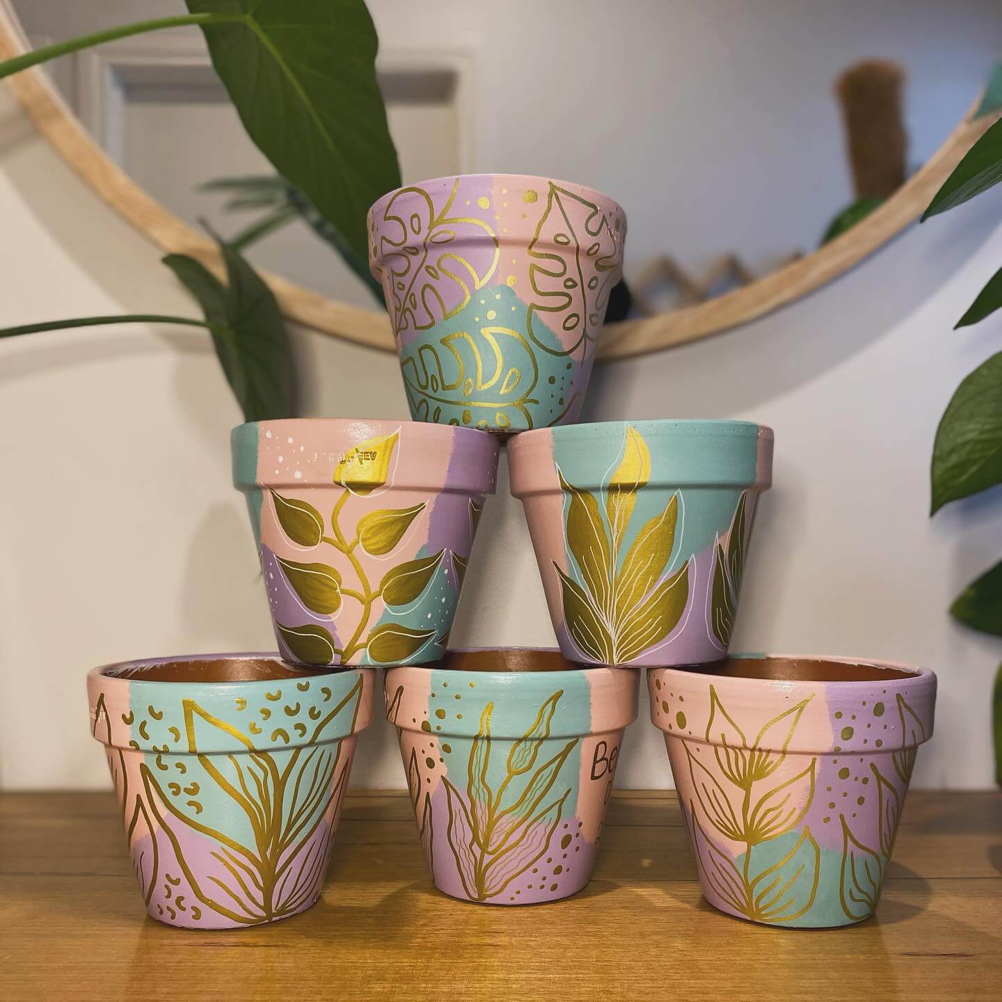
Finish one.
Then stop.
Put the plant inside.
Place the pot where it will live.
Look at it tomorrow.
Then look again in a few days.
Do you still like the amount of paint?
Does the color work with the plant?
Is the pattern visible from where you normally see the pot?
Does it look too busy once surrounded by everything else?
Use those answers before starting pot number two.
You may decide the next design should be simpler.
Maybe you want more natural terra cotta showing.
Perhaps the color you thought would become the accent deserves more space instead.
It’s much easier to change direction after one pot than after you’ve painted eight.
And if that first one doesn’t feel quite right, don’t immediately paint over everything.
Edit Before You Repaint
Ask what is bothering you.
Too many colors?
One unnecessary stripe?
A pattern that continues too far around the pot?
Not enough natural terra cotta showing?
Sometimes you can simplify rather than start again.
And sometimes the design isn’t actually the problem.
Try another plant.
Move the pot.
Pair it with an unpainted one.
Take away another decorative object sitting beside it.
Context can completely change how a hand-painted piece feels.
I’d rather experiment with placement before deciding the whole project failed.
The goal isn’t perfection.
It’s making something you genuinely want to keep looking at.
Do the “Would I Buy This?” Test
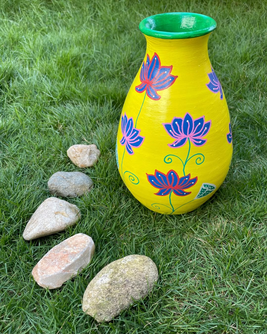
Once the pot is finished, forget for a moment that you painted it.
Put it on a shelf or patio.
Walk away.
Then look at it as though you just saw it in a store.
Would you pick it up?
Would it work with things you already own?
Does it look like something you’d still want next year?
Or do you mostly like it because you remember the work that went into painting it?
There’s nothing wrong with sentimental DIY projects.
But if your goal is hand-painted terra cotta pots that look polished rather than overly crafty, this test is useful.
If you wouldn’t buy it, figure out why.
Maybe there’s one color too many.
Perhaps the pattern needs more breathing room.
Maybe the design would be stronger if part of it disappeared.
Editing doesn’t mean the project failed.
It means you’re making a choice about what actually deserves to stay.
The Best Hand-Painted Terra Cotta Pots Still Look Like Terra Cotta
You don’t need elaborate painting skills to make a plain pot beautiful.
And you don’t need to cover every inch.
Start with where the pot will live.
Prepare the surface properly.
Choose a small palette.
Let one color lead.
Keep patterns simple enough to repeat confidently.
Leave some of the original clay visible.
Then add the plant.
That’s when the design really becomes complete.
If you’re painting several pots, give them one shared detail without making them identical.
Mix painted pieces with natural terra cotta.
Use them where you’d already need a planter instead of adding more decorative clutter.
Most importantly, know when to stop.
One extra color, one extra pattern, or one unnecessary decorative detail can be the difference between a pot that feels considered and one that feels overworked.
You don’t have to fill every empty spot.
Let the clay show.
Let the plant provide some of the beauty.
Let a slightly imperfect brushstroke remind you that somebody actually made it.
Hand-painted terra cotta pots don’t need to look mass-produced.
They just need to look like you knew when the design was finished.
Also read: